Types of Univariate Plots for Continuous Variables
August 29, 2023 · 8 min read
If you have any questions, feel free to comment below. Click the block can copy the code.
And if you think it's helpful to you, just click on the ads which can support this site. Thanks!
A univariate plot (chart for one variable) refers to drawing a corresponding plot using one variable from a dataset. To visualize this variable, a plot must be drawn according to the different data variable types. Data variables are divided into continuous variables and discrete variables.
Types of Univariate Plots #
1.Histogram Plot #
A histogram is a statistical graph used to represent data distribution and dispersion. Its appearance is similar to a bar chart, but the meaning it expresses differs greatly from that of a bar chart.
First, the dataset needs to be grouped, then the number of data elements in each group is counted, and finally a series of rectangles with equal widths and unequal heights is used to represent the corresponding number of data elements in each group. The plotting concept based on “counting data frequencies” is commonly used when drawing some plots with color mapping.
2.Density Plot #
A density plot (also called a density curve plot), as a variant of a histogram, uses a curve (smooth in most cases, though right-angle styles may also appear because of different kernel functions) to reflect numerical levels. Its main function is to reflect the distribution of data over a continuous time period.
Compared with a histogram, a density plot does not display data incompletely because of the number of groups, thereby helping users effectively judge the overall trend of the data. Of course, selecting different kernel functions produces different kernel density estimation plots. In the plotting process for some scientific research papers, the vertical axis of a density plot can be frequency (count) or density.
3.Q-Q Plot (Quantile- Quantile Plot, Also Called a Quantile Plot) #
A Q-Q plot is essentially a probability plot, and its purpose is to test whether a data distribution follows a certain distribution. The key to using a Q-Q plot to test a data distribution is to compare probability distributions by plotting quantiles. First select the interval length. A point (x, y) on a Q-Q plot corresponds to the same quantile of the first distribution (X axis) and the second distribution (Y axis). Therefore, a curve with the number of intervals as a parameter can be drawn. If the two distributions are similar, the Q-Q plot tends to fall on the y = x line. If the two distributions are linearly correlated, the points on the Q-Q plot tend to fall on a straight line.
For example, a Q-Q plot for a normla distribution is a scatter plot that uses the quantiles of the standard normla distribution as the horizontal coordinates and the sample data values as the vertical coordinates. To use a Q-Q plot to identify whether certain sample data follows a normal distribution, simply observe whether the points on the Q-Q plot are approximately near a straight line, and whether the slope of this straight line is the standard deviation and the intercept is the mean.
A Q-Q plot can not only test whether sample data conforms to a certain data distribution, but can also reveal properties of the data in terms of location, scale, and skewness by comparing the shapes of data distributions. In general academic research, histograms or density plots are used to observe data distributions far more frequently than Q-Q plots.
4.P-P Plot (Probability-Probability Plot) #
A P-P plot is a graph drawn according to the relationship between the cumulative probability of a variable and the cumulative probability of a specified theoretical distribution, and is used to visually test whether sample data conforms to a certain probability distribution. When the sample data being tested conforms to the expected distribution, the points in the P-P plot will form a straight line. Both P-P plots and Q-Q plots are used to test whether sample data conforms to a certain distribution; only their testing methods differ.
5.Empirical Distribution Function Plot (Empirical Distribution Function, EDF) #
In statistics, the empirical distribution function is also called the empirical cumulative distribution function. The empirical distribution function is a distribution function related to the test measure of a sample. For a certain value of the measured variable, the value of the distribution function represents the proportion of all test samples that are less than or equal to that value. An empirical distribution function plot is used to test whether sample data conforms to a certain expected distribution.
Histogram #
In Matplotlib, we can use the axes.Axes.Hist () function to draw a histogram.
In the axes.Axes.Hist () function, the parameter x is the sample data to be plotted; the parameter bins is used to define distribution intervals, and its value can be set to an integer, a given numerical sequence, or a string. By default, it is a numerical type with a value of 10. When the value of the parameter bins is an integer, it defines the number of equal-width bins within the range. When the value of the parameter bins is a custom numerical sequence, it defines the bin edge values, including the left edge of the first bin and the right edge of the last bin.
Note that in the situation described above, the spacing between bins may not be equal.
When the value of the parameter bins is a string type, values such as “auto,” “fd,” “rice,” and “sqrt” can be selected. The value corresponding to the density parameter of the axes.Axes.Hist () function is a Boolean type. This parameter determines whether the plotting result is a density plot, and its default value is False.
The following are examples of histograms drawn with Matplotlib, ProPlot, and SciencePlots, respectively:
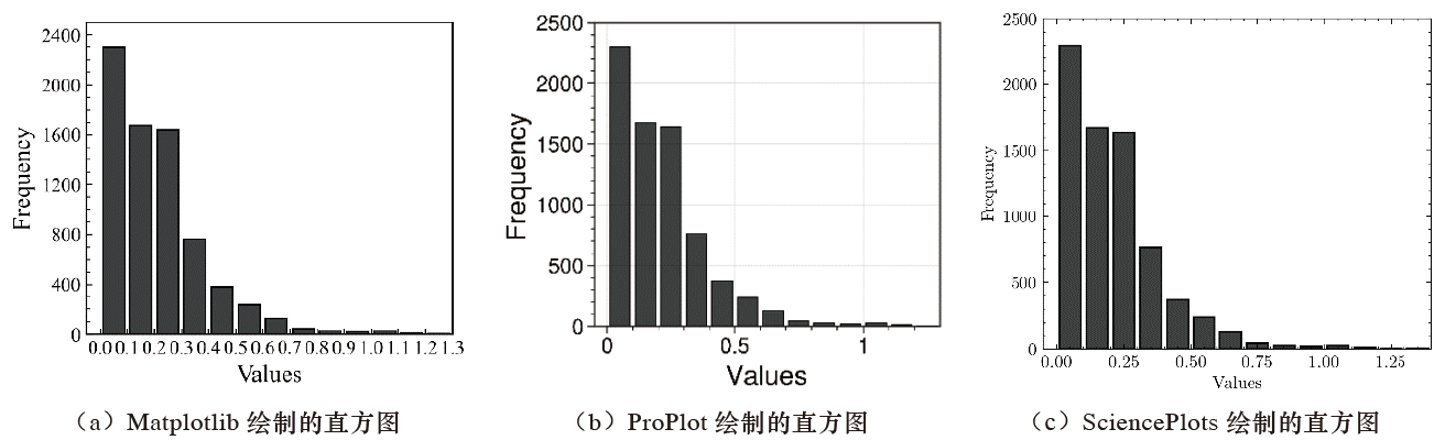
Both (a) and (c) are visualization results drawn based on Matplotlib, and (c) is drawn using a plotting theme from the SciencePlots package. The core plotting code for (a) is given below.
import numpy as np
import pandas as pd

hist_data = pd.read_excel(r"柱形图绘制数.xlsx")

#(a) Histogram drawn with Matplotlib
import matplotlib.pyplot as plt

plt.rcParams["font.family"] = "Times New Roman"
plt.rcParams["axes.linewidth"] = 1
plt.rcParams["axes.labelsize"] = 15
plt.rcParams["xtick.minor.visible"] = True
plt.rcParams["ytick.minor.visible"] = True
plt.rcParams["xtick.direction"] = "in"
plt.rcParams["ytick.direction"] = "in"
plt.rcParams["xtick.labelsize"] = 12
plt.rcParams["ytick.labelsize"] = 12
plt.rcParams["xtick.top"] = False
plt.rcParams["ytick.right"] = False

hist_x_data = hist_data["hist_data"].values
bins = np.arange(0.0,1.5,0.1)

fig,ax = plt.subplots(figsize=(4,3.5),dpi=100,facecolor="w")
hist = ax.hist(x=hist_x_data, bins=bins,color="#3F3F3F",
          edgecolor ='black',rwidth = 0.8)

ax.tick_params(axis="x",which="minor",top=False,bottom=False)
ax.set_xticks(np.arange(0,1.4,0.1))
ax.set_yticks(np.arange(0.,2500,400))
ax.set_xlim(-.05,1.3)
ax.set_ylim(0.0,2500)

ax.set_xlabel('Values', )
ax.set_ylabel('Frequency')

plt.show()
The core plotting code for (b) is as follows:
#(b)Histogram drawn with ProPlot

import proplot as pplt
from proplot import rc
rc["axes.labelsize"] = 15
rc['tick.labelsize'] = 12
rc["suptitle.size"] = 15

hist_x_data = hist_data["hist_data"].values
bins = np.arange(0.0,1.5,0.1)


fig = pplt.figure(figsize=(3.5,3))
ax = fig.subplot()
ax.format(abc='a.', abcloc='ur',abcsize=16,
          xlabel='Values', ylabel='Frequency',
          xlim = (-.05,1.3),ylim=(0,2500))
hist = ax.hist(x=hist_x_data, bins=bins,color="#3F3F3F",
               edgecolor ='black',rwidth = 0.8)

plt.show()
(c) uses an excellent plotting theme from SciencePlots. The user only needs to add the following code before the plotting script.
with plt.style.context(['science']):
The core code is as follows:
import pandas as pd
import numpy as np
import seaborn as sns
import matplotlib.pyplot as plt

hist_x_data = hist_data["hist_data"].values
bins = np.arange(0.0,1.5,0.1)


with plt.style.context(['science']):
    fig,ax = plt.subplots(figsize=(4,3.5),dpi=100,facecolor="w")
    hist = ax.hist(x=hist_x_data, bins=bins,color="#3F3F3F",
                   edgecolor ='black',rwidth = 0.8)
    ax.set_xlim(-.05,1.4)
    ax.set_ylim(0.0,2500)
    ax.set_xlabel('Values', )
    ax.set_ylabel('Frequency')

plt.show()
Sometimes, to display some necessary statistical information, we need to add a normal distribution curve, mean line, median line, and so on to a histogram, or represent data points at positions on the X axis with short vertical lines.
An example of a histogram with a normal distribution curve and median line drawn with Matplotlib is shown below:
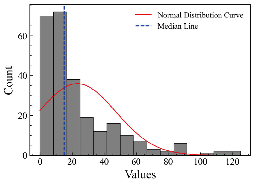
The difficulty in drawing a histogram with statistical information lies in calculating and drawing the normal distribution curve. We can use the scipy.Stats.Norm () function to perform a normal fit on the plotted data and calculate the Probability Density Function (PDF) result.
Because the probability density function result is normalized, meaning that the area beneath the curve is 1, while the total area of the histogram is the product of the number of samples and the width of each bin, plotting the result of multiplying the probability density function result by the number of samples and the bin width scales the plotted curve to the height of the histogram.
The plotting code for the figure above is as follows:
import numpy as np
import pandas as pd

hist_data = pd.read_csv(r"直方图绘制02.xlsx")

hist_x_data = hist_data02["hist_data"].values
X_mean = np.mean(hist_x_data)


# Figure 3-2-2 Example of drawing a histogram with statistical information
from scipy.stats import norm
import matplotlib.pyplot as plt

bins=15
hist_x_data = hist_data02["hist_data"].values

Median = np.median(hist_x_data)

mu, std = norm.fit(hist_x_data)

fig,ax = plt.subplots(figsize=(5,3.5),dpi=100,facecolor="w")
hist = ax.hist(x=hist_x_data, bins=bins,color="gray",
               edgecolor ='black',lw=.5)
# Plot the PDF.
xmin, xmax = min(hist_x_data),max(hist_x_data)
x = np.linspace(xmin, xmax, 100) # 100 is selected at random; the larger the value, the denser the plotted curve
p = norm.pdf(x, mu, std)
N = len(hist_x_data)
bin_width = (x.max() - x.min()) / bins
ax.plot(x, p*N*bin_width,linewidth=1,color="r",label="Normal Distribution Curve")

# Add the mean line
ax.axvline(x=Median,ls="--",lw=1.2,color="b",label="Median Line")
ax.set_xlabel('Values')
ax.set_ylabel('Count')
ax.legend(frameon=False)

plt.show()
The following are examples of histograms with statistical information drawn using ProPlot and SciencePlots.

The a. in (a) is the figure number and can be added according to the actual situation. In addition to drawing histograms using the methods described above, we can also use the histplot () function in Seaborn, which is more flexible to use.
# (a) Example of a histogram with statistical information drawn using ProPlot
from scipy.stats import norm
from proplot import rc

rc["axes.labelsize"] = 15
rc['tick.labelsize'] = 12
rc["suptitle.size"] = 15


bins=15
hist_x_data = hist_data["hist_data"].values
Median = np.median(hist_x_data)
mu, std = norm.fit(hist_x_data)

fig = pplt.figure(figsize=(3.5,3))
ax = fig.subplot()
ax.format(abc='a.', abcloc='ur',abcsize=16,
          xlabel='Values', ylabel='Count')

hist = ax.hist(x=hist_x_data, bins=bins,color="gray",
               edgecolor ='black',lw=.5)
# Plot the PDF.
xmin, xmax = min(hist_x_data),max(hist_x_data)
x = np.linspace(xmin, xmax, 100)
p = norm.pdf(x, mu, std)
N = len(hist_x_data)
bin_width = (x.max() - x.min()) / bins
ax.plot(x, p*N*bin_width,linewidth=1,color="r",label="Normal Distribution Curve")
# Add the mean line
ax.axvline(x=Median,ls="--",lw=1.2,color="b",label="Median Line")
ax.legend(ncols=1,frameon=False,loc="ur")
plt.show()
# (b) Example of a histogram with statistical information drawn using SciencePlots

from scipy.stats import norm

bins=15
hist_x_data = hist_data["hist_data"].values
Median = np.median(hist_x_data)
mu, std = norm.fit(hist_x_data)
xmin, xmax = min(hist_x_data),max(hist_x_data)
x = np.linspace(xmin, xmax, 100)
p = norm.pdf(x, mu, std)
N = len(hist_x_data)
bin_width = (x.max() - x.min()) / bins

with plt.style.context(['science']):
    fig,ax = plt.subplots(figsize=(4,3.5),dpi=100,facecolor="w")
    hist = ax.hist(x=hist_x_data, bins=bins,color="gray",
                   edgecolor ='black',lw=.5)
    ax.plot(x, p*N*bin_width,linewidth=1,color="r",label="Normal Distribution Curve")

    # Add the mean line
    ax.axvline(x=Median,ls="--",lw=1.2,color="b",label="Median Line")
    ax.set_xlabel('Values')
    ax.set_ylabel('Count')
    ax.legend(frameon=False)

plt.show()
Related readings
- SciencePlots Basics and Features
- ProPlot Basics and Features
- Seaborn Basics and Features
- Foundations of Scientific Figure Design and Color
- Plotting Tools and Their Key Features
If you want to follow my updates, or have a coffee chat with me, feel free to connect with me: