Seaborn Basics and Features
August 24, 2023 · 3 min read
If you have any questions, feel free to comment below. Click the block can copy the code.
And if you think it's helpful to you, just click on the ads which can support this site. Thanks!
Seaborn provides a more advanced encapsulation on top of Matplotlib, enabling users to use very little code to draw a visualization library for scientific paper figures with rich statistical information. Seaborn is based on Matplotlib, most parameters of plotting functions in Matplotlib can be used in Seaborn plotting functions, and it provides good support for other Python libraries (such as Numpy/Pandas/Scipy).
Install Matplotlib
python -m pip install matplotlib
Install Seaborn
pip install seaborn
Plot Types #
The types of plots that Seaborn provides for drawing include
- statistical relationships
- distributions of data
- categorical data
- regression model analysis (regressionModels)
- multi-plot grids
Relational Plots #
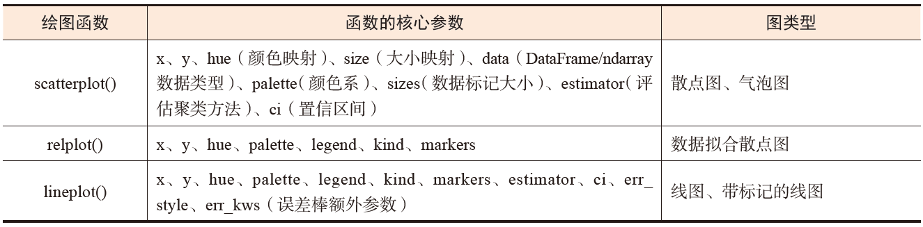
The interrelationships and degree of interdependence among dataset variables can all be learned by statistically analyzing the correlations among variables. The relational plotting functions in Seaborn are shown below:
Data Distribution Plots #
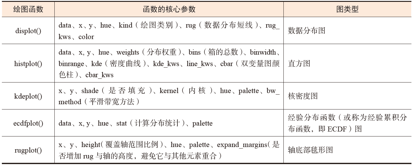
Before analyzing or modeling data, we first need to understand the distribution of the data, as well as basic conditions such as the data’s coverage range, central tendency, and outliers.
Data distribution plotting functions in Seaborn:
Categorical Data Plots #
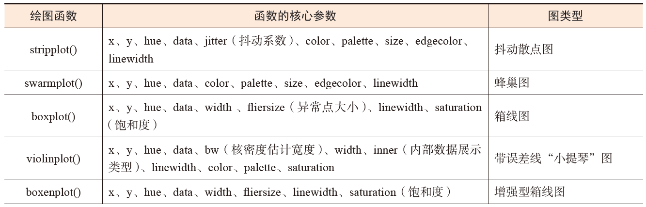
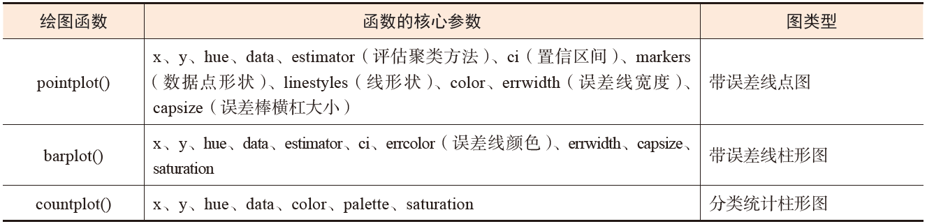
When facing a situation in which a data group has discrete variables (categorical variables), we can use plotting functions that take the X-axis or Y-axis as the categorical axis to draw categorical data plots.
Common categorical data plotting functions in Seaborn:
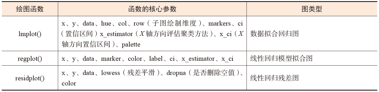
Regression Model Analysis Plots #
We can use regression model analysis plots to represent relationships among variables in a dataset and use statistical models to estimate the relationship between two groups of variables.
Regression analysis plotting functions in Seaborn:
Multi-Plot Grid Plots #
Compared with Matplotlib, Seaborn provides multiple subplot grid plotting functions, which can quickly display faceted plots. When facing plotting requirements such as plotting by data subset, displaying subplots in rows or columns, and combining different plot types, multi-plot grid drawing functionality can not only visualize the changes of each variable in the dataset all at once, but also reduce the time required to draw complex plots.
FacetGrid () Function #
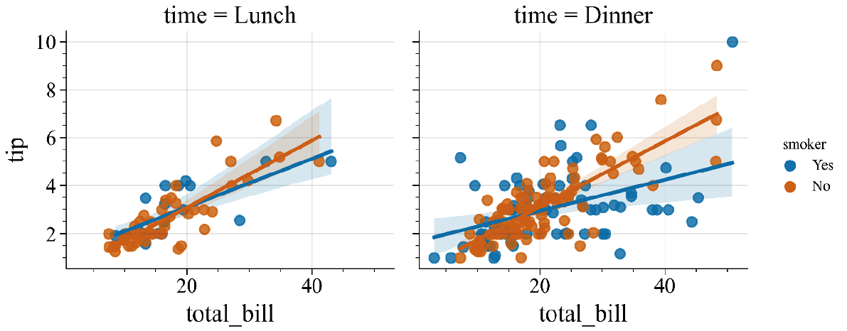
The FacetGrid () function provided by Seaborn can visually display the distribution of any variable in a dataset and the relationships among multiple variables in subsets of the dataset.
The FacetGrid() function can implement numerical mapping across the three dimensions of row, column, and hue. Among them, the row and column dimensions have a clear correspondence with the resulting array of axes, and the hue variable can be regarded as a third dimension along the depth axis, using different colors to draw data at different levels.
Core code;
import seaborn as sns
import matplotlib.pyplot as plt
g = sns.FacetGrid (df, col ='time ', hue = 'smoker ')
g.map (sns.regplot, "total_ bill", "tip")
g.add_legend ( )
Faceted plot result:
PairGrid () Function #
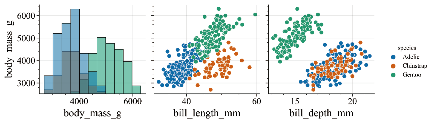
The PairGrid () function provided by Seaborn is mainly used to draw multi-plot grid plots with pairwise relationships in datasets. In the PairGrid () function, each row and column is assigned a different variable, resulting in a plot that displays relationships between paired variables in the dataset. This type of plot is also called a “scatterplot matrix.”
Core code:
import Seaborn as sns
import matplotlib.pyplot as plt
penguins = sns.load_dataset ("penguins")
x_vars = ["body_mass_g", "bill_length_mm", "bill_depth_mm",]
y_vars = ["body_mass_g"]
g = sns.PairGrid(penguins,hue="species", x_vars=x_vars, y_vars=y_vars)
g.map_diag (sns.histplot, color=".3")
g.map_offdiag(sns.scatterplot)
g.add_legend ()
Plotting Styles, Color Themes, and Plotting Element Scaling Ratios #
Compared with Matplotlib, Seaborn has more plotting styles and color themes. Set the color theme, plotting style, and plotting element scaling ratio through the following functions.
sns.set_style("style name") # Set the plotting style
sns.set_palette("palette_name")# Set the color theme
sns.set_context("context_name")# Set the plotting element scaling ratio
The
set_theme ()function provided by Seaborn includes all the functionality of the three functions above; that is, by setting thepalette,style, andcontextparameters in theset_theme()function, you can control the color theme, plotting style, and plotting element scaling ratio, respectively.
Plotting Styles #
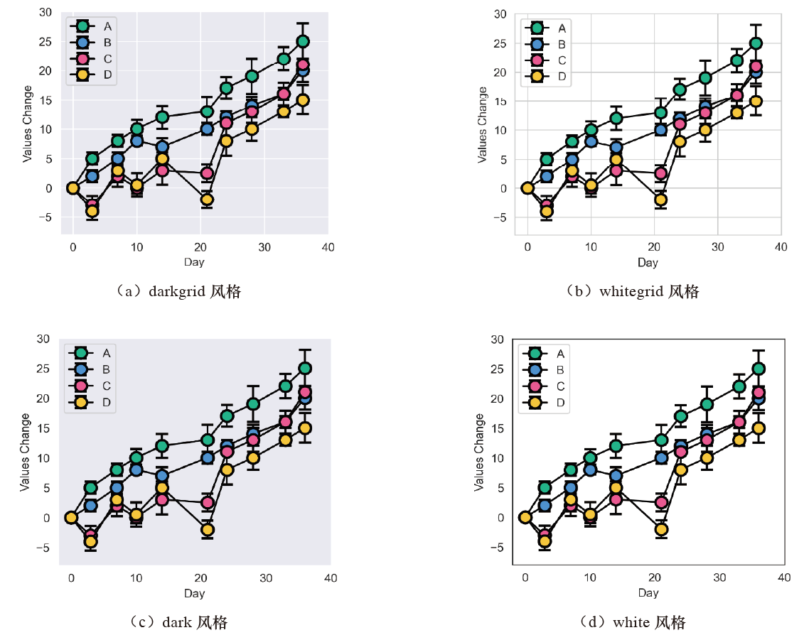
The optional values for the style parameter of set_style() include darkgrid, whitegrid, dark, white, and ticks, while the rc parameter is used for parameter mappings that override values in the preset Seaborn style dictionary, updating only some parameters in the style.
Below are the visual effects of four plotting styles:
Color Themes #
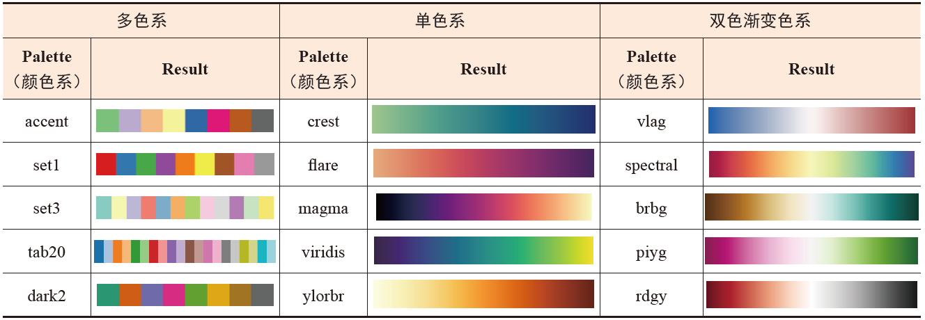
The set_palette() function includes three categories of color themes: qualitative, sequential, and diverging color schemes. The display effects of different color themes can be viewed through the sns.color_palette () function.
Visual effects of some color theme options in Seaborn:
Plotting Element Scaling Ratios #
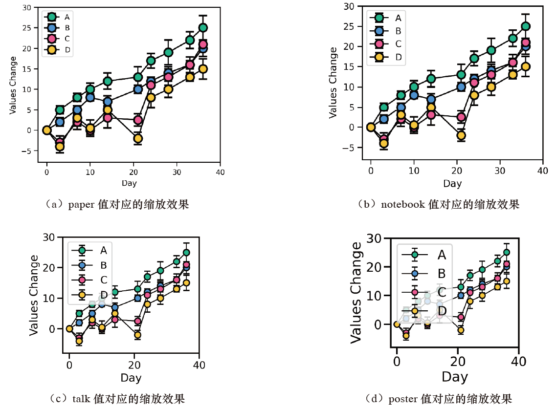
The optional values for the context parameter of the set_context() function are paper, notebook (default), talk, and poster, with the scaling ratio increasing in sequence.
Related readings
- Foundations of Scientific Figure Design and Color
- Plotting Tools and Their Key Features
- Overview of the AI Development Software Environment
- Image Classification and Foundational Vision Models
If you want to follow my updates, or have a coffee chat with me, feel free to connect with me: