ProPlot Basics and Features
August 25, 2023 · 12 min read
If you have any questions, feel free to comment below. Click the block can copy the code.
And if you think it's helpful to you, just click on the ads which can support this site. Thanks!
Figures for scientific papers impose higher requirements on the rendering conditions of multilayer elements (fonts, axes, legends, etc.), and we need to change multiple rendering parameters in Matplotlib and Seaborn, especially when drawing complex figures containing multiple subplots, which can easily make the plotting code verbose.
As a concise Matplotlib wrapper, the ProPlot library is a high-level wrapper for Matplotlib’s object-oriented plotting method (object-oriented interface), integrating the cartopy/Basemap mapping libraries, xarray, and pandas, and can compensate for some of Matplotlib’s shortcomings. ProPlot can give Matplotlib enthusiasts a smoother plotting experience.
Multiple Subplot Drawing and Processing #
Shared Axis Labels #
When using Matplotlib to draw multiple subplots, repeated drawing operations for axis tick labels, axis labels, colorbars, and legends are unavoidable, resulting in verbose plotting code. In addition, we also need to add sequential labels (such as a, b, c, etc.) to each subplot. ProPlot can directly draw subplot labels in different styles through its built-in methods, whereas Matplotlib requires custom functions to draw them.
The sharex, sharey, and share parameters of the figure () function in ProPlot can be used to control different axis label styles. Their optional values and descriptions are as follows:

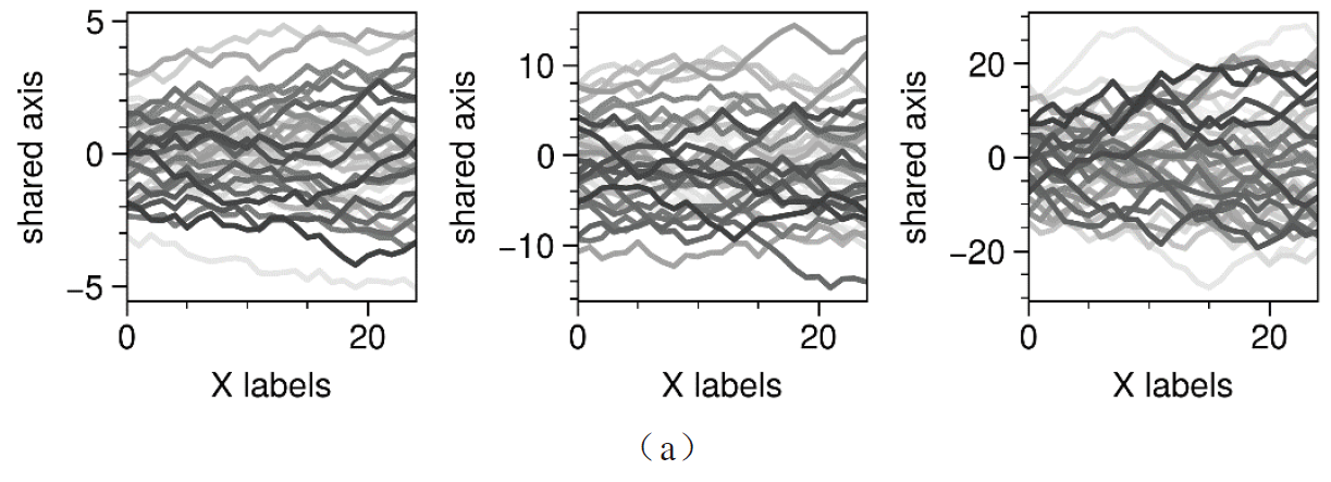
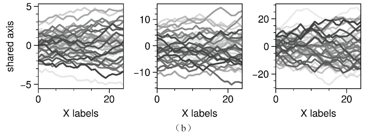
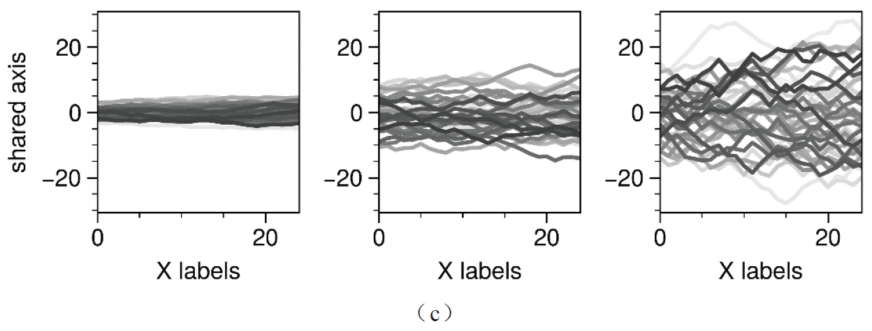
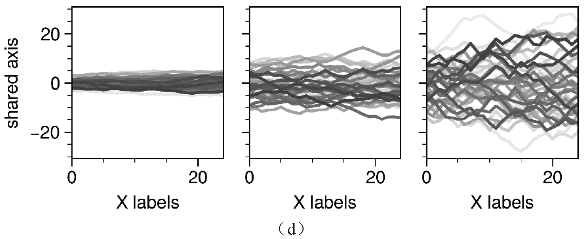
Below is a schematic diagram of shared axis labels for multiple subplots drawn using ProPlot, where
- (a) is the style without shared axis labels;
- (b) is the style with shared Y-axis labels set;
- (c) shows the style when the Y-axis sharing method is set to Limits. As can be seen, the tick range of each subplot is forced to be the same, causing some subplots to be displayed incompletely;
- (d) shows the style when the Y-axis sharing method is set to True. At this time, both axis labels and tick labels are shared.
import pandas as pd
import numpy as np
import proplot as pplt
import matplotlib.pyplot as plt

N = 50
M = 40
state = np.random.RandomState(51423)
cycle = pplt.Cycle('grays', M, left=0.1, right=0.8)

datas = []
for scale in (1, 3, 7, 0.2):
    data = scale * (state.rand(N, M) - 0.5).cumsum(axis=0)[N // 2:, :]
    datas.append(data)

# Plots with different sharing and spanning settings
# Note that span=True and share=True are the defaults
spans = (False, False, False, False)
shares = (False, 'labels', 'limits', True)
for i, (span, share) in enumerate(zip(spans, shares)):
	# note: there is sharey
    fig = pplt.figure(refaspect=1, refwidth=1.06, spanx=span, sharey=share)
    axs = fig.subplots(ncols=3)
    for ax, data in zip(axs, datas):
        on = ('off', 'on')[int(span)]
        ax.plot(data, cycle=cycle)
        ax.format(
            grid=False, xlabel='X labels', ylabel='shared axis',
            #suptitle=f'Sharing mode {share!r} (level {i}) with spanning labels {on}'
        )
        fig.save(r'\第2章 绘制工具及其重要特征\Proplot_subplot_share'+str(share)+'.png', bbox_inches='tight',dpi=600)
        fig.save(r'\第2章 绘制工具及其重要特征\\Proplot_subplot_share'+str(share)+'.pdf', bbox_inches='tight')

plt.show()
“Spanning” Axis Labels #
The spanx, spany, and span parameters in the figure() function are used to control whether “spanning” axis labels are used for the X-axis, Y-axis, or both axes; that is, when the X-axis and Y-axis labels of multiple subplots are the same, a single axis label can be used instead.
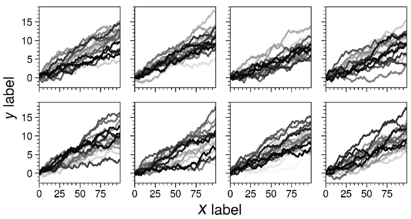
import pandas as pd
import numpy as np
import proplot as pplt
import matplotlib.pyplot as plt


state = np.random.RandomState(51423)

# Plots with minimum and maximum sharing settings
# Note that all x and y axis limits and ticks are identical
spans = (True, True)
shares = (True, 'all')
titles = ('Minimum sharing', 'Maximum sharing')
for span, share, title in zip(spans, shares, titles):
    fig = pplt.figure(refwidth=1, span=span, share=share)
    axs = fig.subplots(nrows=2, ncols=4)
    for ax in axs:
        data = (state.rand(100, 20) - 0.4).cumsum(axis=0)
        ax.plot(data, cycle='grays')
    axs.format(
        xlabel='xlabel', ylabel='ylabel',
        grid=False, xticks=25, yticks=5,labelsize=13
    )
fig.save(r'\第2章 绘制工具及其重要特征\图2-3-2 Proplot_subplot_span.png',
         bbox_inches='tight',dpi=600)
fig.save(r'\第2章 绘制工具及其重要特征\图2-3-2 Proplot_subplot_span.pdf',
         bbox_inches='tight')


plt.show()
Drawing Multiple Subplot Labels #
When figures for scientific papers contain multiple subplots, one task is to label each subplot sequentially. The ProPlot library provides a flexible format () method for plotting objects (figure.Figure and axes.Axes), which can be used to draw different subplot label styles and positions.
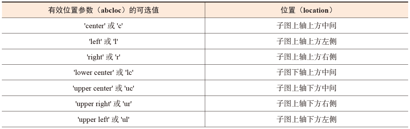
The optional values for the position parameter (abcloc) in the format() function are as follows:

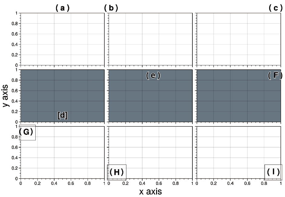
Among them, background borders are added to subplot labels G–I, which is achieved by setting the abcbbox parameter of the format () function to True. In addition, the parameters abcborder, abc_kw, and abctitlepad are used to control the text border of the subplot labels, text attributes (color, weight, etc.), and spacing attributes between the subplot labels and subplot titles, respectively.
import pandas as pd
import numpy as np
import proplot as pplt
import matplotlib.pyplot as plt


fig = pplt.figure(figsize=(8,5.5),space=1, refwidth='10em')
axs = fig.subplots(nrows=3, ncols=3)
locs = ("c","l","r","lc","uc","ur","ul","ll","lr")
abcs = ("a","a.","(a)","[a]","(a","A","A.","(A)","(A.)")
axs.format(abcsize=16,xlabel='x axis', ylabel='y axis',labelsize=18)
axs[-3:].format(abcbbox=True)
axs[0, 0].format(abc="a", abcloc="c",abcborder=True)
axs[0, 1].format(abc="a.", abcloc="l")
axs[0, 2].format(abc="(a)", abcloc="r")
axs[1, 0].format(abc="[a]", abcloc="lc",facecolor='gray5')
axs[1, 1].format(abc="(a", abcloc="uc",facecolor='gray5')
axs[1, 2].format(abc="A", abcloc="ur",facecolor='gray5')
axs[2, 0].format(abc="A.", abcloc="ul",)
axs[2, 1].format(abc="(A)", abcloc="ll")
axs[2, 2].format(abc="(A.)", abcloc="lr")
fig.save(r'\第2章 绘制工具及其重要特征\\图2-3-3 Proplot_abc.png',
         bbox_inches='tight',dpi=600)
fig.save(r'\第2章 绘制工具及其重要特征\\图2-3-3 Proplot_abc.pdf',
         bbox_inches='tight')
plt.show()
For more examples of adding and modifying subplot attributes, see the official ProPlot tutorial.
Simpler Colorbars and Legends #
When using Matplotlib, drawing legends outside subplots is sometimes troublesome. Usually, we need to manually position the legend and adjust the spacing between the figure and the legend to make room for the legend in the plotting object. In addition, when drawing a colorbar outside a subplot, such as
fig.colorbar (..., ax=ax), part of the space must be borrowed from the parent figure, which may cause asymmetry problems in the display of figure objects with multiple subplots. In Matplotlib, it is usually also difficult to draw colorbars inserted inside plotting objects and generate external colorbars with widths consistent with the subplot, because the inserted colorbar may be too wide or too narrow, causing problems such as proportional inconsistency with the entire subplot.
A colorbar is a long, narrow small plot beside the main plot that can help indicate the color composition of the colormap in the main plot and the correspondence between colors and values.
The ProPlot library has a simple framework for colorbars and legends specifically used to draw a single subplot or multiple contiguous subplots. This framework passes the position parameter to ProPlot’s axes.Axes.colorbar or axes.Axes.legend to draw colorbars or legends at different positions for specific subplots.
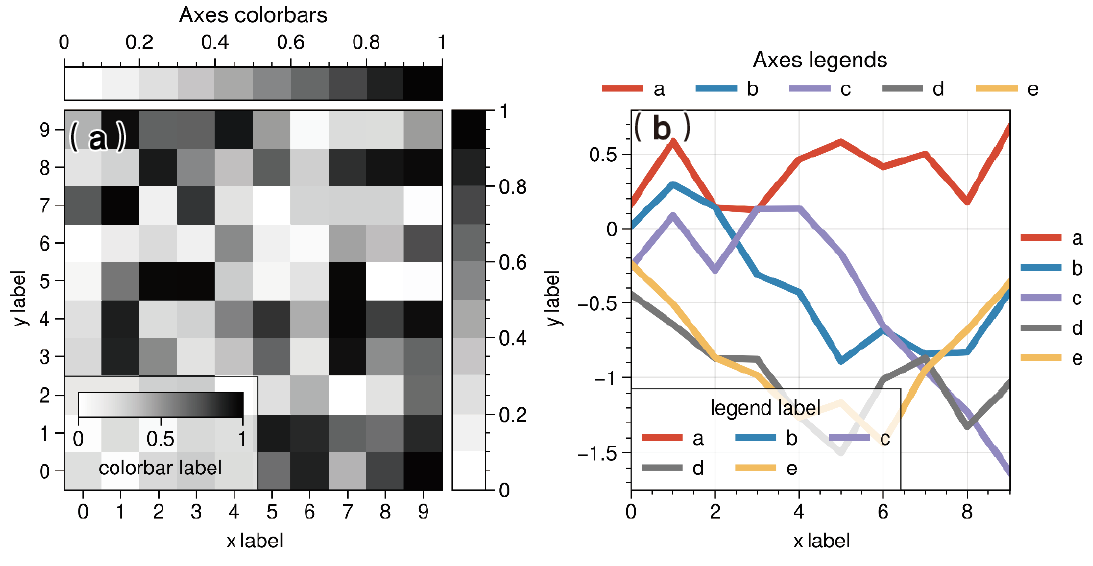
import pandas as pd
import numpy as np
import proplot as pplt
import matplotlib.pyplot as plt

fig = pplt.figure(share=False, refwidth=2.3)

# Colorbars
ax = fig.subplot(121)
state = np.random.RandomState(51423)
m = ax.heatmap(state.rand(10, 10), colorbar='t', cmap='grays')
ax.colorbar(m, loc='r')
ax.colorbar(m, loc='ll', label='colorbar label')
ax.format(title='Axes colorbars')

# Legends
ax = fig.subplot(122)
ax.format(title='Axes legends', titlepad='0em')
hs = ax.plot(
    (state.rand(10, 5) - 0.5).cumsum(axis=0), linewidth=3,
    cycle='ggplot', legend='t',
    labels=list('abcde'), legend_kw={'ncols': 5, 'frame': False}
)
ax.legend(hs, loc='r', ncols=1, frame=False)
ax.legend(hs, loc='ll', label='legend label')
fig.format(abc="(a)", abcloc="ul",abcsize=15,
           xlabel='xlabel', ylabel='ylabel')

fig.save('\第2章 绘制工具及其重要特征\图2-3-4 Proplot_axes_cb_legend.png',
         bbox_inches='tight',dpi=600)
fig.save('\第2章 绘制工具及其重要特征\图2-3-4 Proplot_axes_cb_legend.pdf',
         bbox_inches='tight')
plt.show()
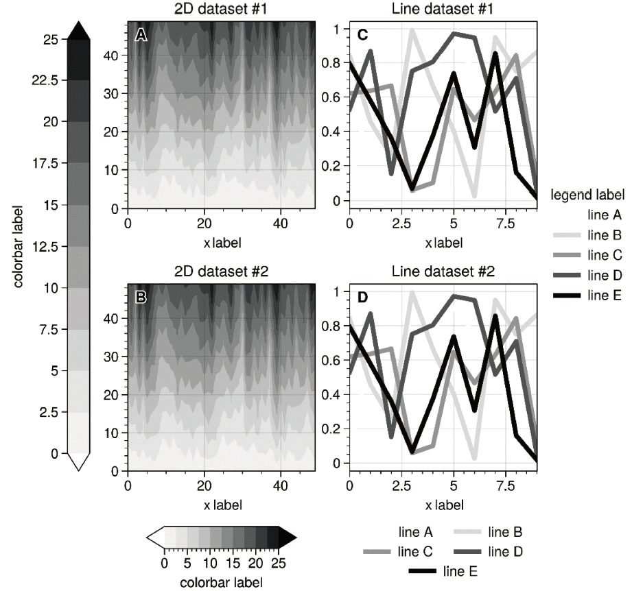
To draw a colorbar or legend along the edge of the figure, simply use proplot.figure.Figure.colorbar and proplot.figure.Figure.legend.
import pandas as pd
import numpy as np
import proplot as pplt
import matplotlib.pyplot as plt


state = np.random.RandomState(51423)
fig, axs = pplt.subplots(
    ncols=2, nrows=2, order='F', refwidth=1.7, wspace=2.5, share=False
)

# Plot data
data = (state.rand(50, 50) - 0.1).cumsum(axis=0)
for ax in axs[:2]:
    m = ax.contourf(data, cmap='grays', extend='both')
hs = []
colors = pplt.get_colors('grays', 5)
for abc, color in zip('ABCDEF', colors):
    data = state.rand(10)
    for ax in axs[2:]:
        h, = ax.plot(data, color=color, lw=3, label=f'line {abc}')
    hs.append(h)

# Add colorbars and legends
fig.colorbar(m, length=0.8, label='colorbar label', loc='b', col=1, locator=5)
fig.colorbar(m, label='colorbar label', loc='l')
fig.legend(hs, ncols=2, center=True, frame=False, loc='b', col=2)
fig.legend(hs, ncols=1, label='legend label', frame=False, loc='r')
fig.format(abc='A', abcloc='ul')
for ax, title in zip(axs, ('2D {} #1', '2D {} #2', 'Line {} #1', 'Line {} #2')):
    ax.format(xlabel='xlabel', title=title.format('dataset'))

fig.save(r'\第2章 绘制工具及其重要特征\Proplot_figure_cb_legend.png',
         bbox_inches='tight',dpi=600)
fig.save(r'\第2章 绘制工具及其重要特征\Proplot_figure_cb_legend.pdf',
         bbox_inches='tight')
plt.show()
More Attractive Colors and Fonts #
A common problem in scientific visualization is using misleading colormaps such as “jet” to map corresponding values. This kind of colormap has obvious visual defects in hue, saturation, and brightness. Matplotlib has few colormap options to choose from, with only a few colormaps of similar hues, and cannot handle more complex value-mapping scenarios.
The ProPlot library wraps a large number of colormap options. It not only provides multiple colormap options from extension packages such as Seaborn, cmOcean, and SciVisColor and projects such as Scientific colour maps, but also defines some default color options and a PerceptualColormap class for generating new colorbars.
Matplotlib’s default plotting font is DejaVu Sans. This font is open source, but aesthetically speaking, it is not very pleasing. The ProPlot library also comes with several other sans-serif fonts and the entire TeX Gyre font family, which better meet the figure-drawing requirements of some scientific journals for scientific papers.
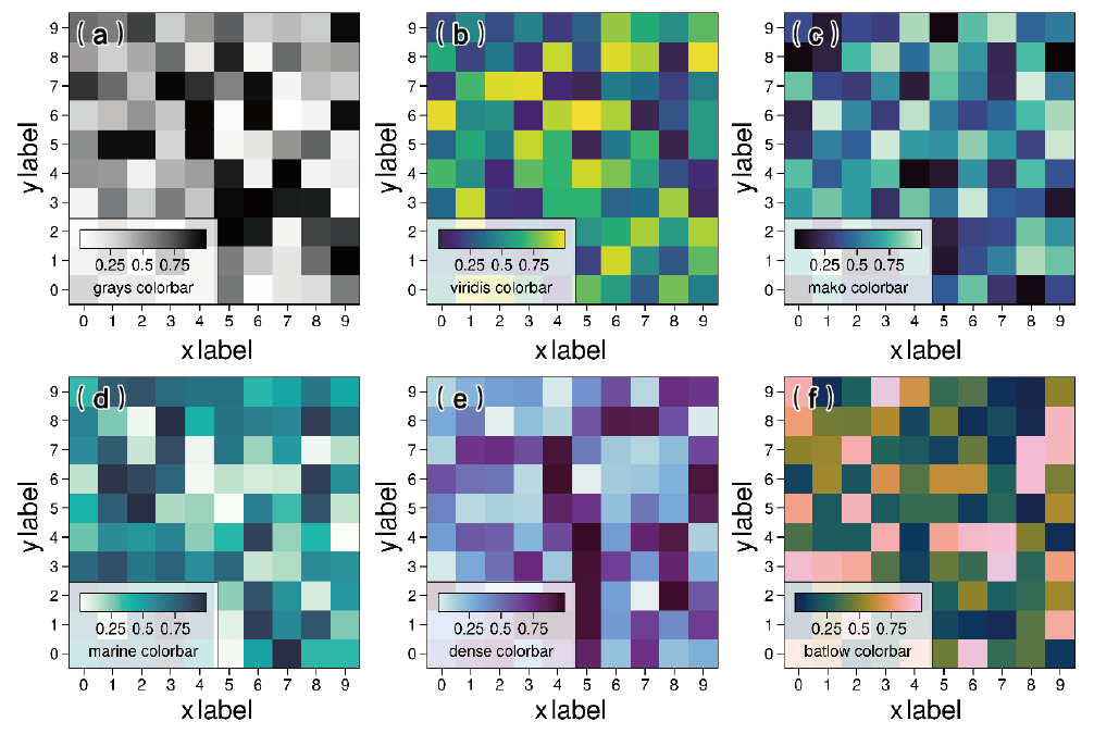
Below are renderings of different colormaps drawn using different ProPlot colormap options. (a) is the gray (grays) family colormap (b) is Matplotlib’s default viridis colormap (c) is the mako colormap in Seaborn (d) is the marine colormap in ProPlot (e) is the dense colormap in cmOcean (f) is the batlow colormap in Scientific colour maps.
import pandas as pd
import numpy as np
import proplot as pplt
import matplotlib.pyplot as plt


fig = pplt.figure(share=False, refwidth=2.3)

# Colorbars
ax = fig.subplot(231)
state = np.random.RandomState(51423)
data = 1 + (state.rand(12, 10) - 0.45).cumsum(axis=0)
m = ax.heatmap(state.rand(10, 10), cmap='grays')
ax.colorbar(m, loc='ll', label='grays colorbar')
ax = fig.subplot(232)
m = ax.heatmap(state.rand(10, 10), cmap='viridis')
ax.colorbar(m, loc='ll', label='viridis colorbar')

ax = fig.subplot(233)
m = ax.heatmap(state.rand(10, 10), cmap='mako')
ax.colorbar(m, loc='ll', label='mako colorbar')

ax = fig.subplot(234)
m = ax.heatmap(state.rand(10, 10), cmap='marine')
ax.colorbar(m, loc='ll', label='marine colorbar')

ax = fig.subplot(235)
m = ax.heatmap(state.rand(10, 10), cmap='dense')
ax.colorbar(m, loc='ll', label='dense colorbar')

ax = fig.subplot(236)
m = ax.heatmap(state.rand(10, 10), cmap='batlow')
ax.colorbar(m, loc='ll', label='batlow colorbar')

fig.format(abc="(a)", abcloc="ul",abcsize=15,
           xlabel='xlabel', ylabel='ylabel',labelsize=15)

fig.save(r'\第2章 绘制工具及其重要特征\图2-3-6 Proplot_colormaps.png',
         bbox_inches='tight',dpi=600)
fig.save(r'\第2章 绘制工具及其重要特征\图2-3-6 Proplot_colormaps.pdf',
         bbox_inches='tight')
plt.show()
For the drawing of more colormaps, please refer to the official ProPlot tutorial.
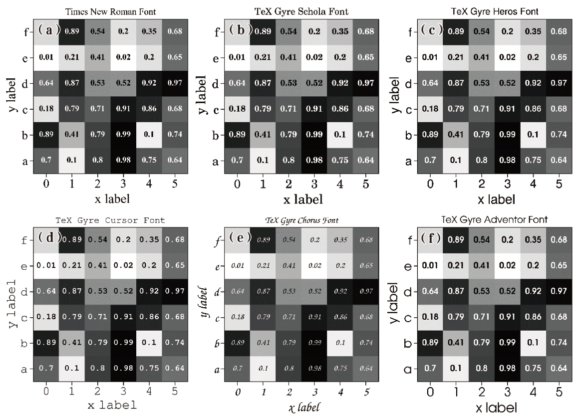
Below are the visualization results drawn with some fonts in ProPlot, among which the three fonts shown in (a), (b), and (c) are commonly used fonts in drawing figures for scientific papers.
import pandas as pd
import numpy as np
import proplot as pplt
import matplotlib.pyplot as plt
from proplot import rc

# Sample data
state = np.random.RandomState(51423)
data = state.rand(6, 6)
data = pd.DataFrame(data, index=pd.Index(['a', 'b', 'c', 'd', 'e', 'f']))

fig = pplt.figure(share=False, refwidth=2.3)
# The rc parameter is used to override parameter mappings for values in the preset style dictionary, updating only some of the parameters in the style.
rc["font.family"] = "Times New Roman"
ax = fig.subplot(231)
m = ax.heatmap(
    data, cmap='grays',
    labels=True, precision=2, labels_kw={'weight': 'bold'}
)
ax.format(title='Times New Roman Font')

rc["font.family"] = "TeX Gyre Schola"
ax = fig.subplot(232)
m = ax.heatmap(
    data, cmap='grays',
    labels=True, precision=2, labels_kw={'weight': 'bold'}
)
ax.format(title='TeX Gyre Schola Font')

rc["font.family"] = "TeX Gyre Heros"
ax = fig.subplot(233)
m = ax.heatmap(
    data, cmap='grays',
    labels=True, precision=2, labels_kw={'weight': 'bold'}
)
ax.format(title='TeX Gyre Heros Font')

rc["font.family"] = "TeX Gyre Cursor"
ax = fig.subplot(234)
m = ax.heatmap(
    data, cmap='grays',
    labels=True, precision=2, labels_kw={'weight': 'bold'}
)
ax.format(title='TeX Gyre Cursor Font')

rc["font.family"] = "TeX Gyre Chorus"
ax = fig.subplot(235)
m = ax.heatmap(
    data, cmap='grays',
    labels=True, precision=2, labels_kw={'weight': 'bold'}
)
ax.format(title='TeX Gyre Chorus Font')

rc["font.family"] = "TeX Gyre Adventor"
ax = fig.subplot(236)
m = ax.heatmap(
    data, cmap='grays',
    labels=True, precision=2, labels_kw={'weight': 'bold'}
)
ax.format(title='TeX Gyre Adventor Font')

fig.format(abc="(a)", abcloc="ul",abcsize=15,
           xlabel='xlabel', ylabel='ylabel',labelsize=14)


fig.save(r'\第2章 绘制工具及其重要特征\图2-3-7 Proplot_fonts.png',
         bbox_inches='tight',dpi=600)
fig.save(r'\第2章 绘制工具及其重要特征\图2-3-7 Proplot_fonts.pdf',
         bbox_inches='tight')
plt.show()
The ProPlot plotting toolkit is a high-quality third-party extension library based on the basic Python plotting tool Matplotlib. You can use its own plotting functions to draw different types of plots, or use only its high-quality plotting themes, that is, import the ProPlot library.
The above code is based on ProPlot version 0.9.5 and does not include upgrade optimizations from versions subsequent to Matplotlib 3.4.3. ProPlot version 0.9.5 does not support the Matplotlib 3.5 series. To use ProPlot to draw graphical results for different needs or use ProPlot’s high-quality academic-style plotting themes, you can install a Matplotlib 3.4 series version yourself.
Related readings
- Seaborn Basics and Features
- Foundations of Scientific Figure Design and Color
- Plotting Tools and Their Key Features
- Overview of the AI Development Software Environment
- Image Classification and Foundational Vision Models
If you want to follow my updates, or have a coffee chat with me, feel free to connect with me: