Foundations of Scientific Figure Design and Color
August 23, 2023 · 12 min read
If you have any questions, feel free to comment below. Click the block can copy the code.
And if you think it's helpful to you, just click on the ads which can support this site. Thanks!
Fundamentals of Drawing Scientific Paper Figures #
Drawing Specifications #
1.Classification and Composition of Scientific Paper Figures #
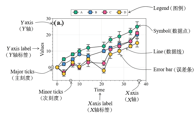
Example of the basic composition of a scientific paper figure
2.Formats and Dimensions of Scientific Paper Figures #
Common illustration formats in scientific papers include raster images and vector graphics.
- A raster image (bitmap) uses individual pixels as units and displays an image format by combining and arranging pixels. After a raster image is enlarged to a certain degree, it becomes distorted and blurry. Common raster image formats include JPEG, PSD, PNG, and TIFF. Among them, JEPG is a commonly used lossy compressed image format that is relatively easy to process, but it has low pixel resolution, poor clarity, and substantial color loss.
- A vector graphic is an image represented using geometric primitives based on mathematical equations, such as points, straight lines, or polygons. A vector graphic file contains independently separated images that can be freely and unlimitedly recombined. Its characteristic is that the image will not become distorted after enlargement; that is, it is independent of resolution. Common vector graphic formats include EPS, PDF, AI, and SVG. Among them, EPS image files are small, have high display quality and high color fidelity, and their lettering is relatively clear when printed, making EPS a commonly used format for scientific paper figures; the AI format is an image format that can be modified again and is also a commonly used illustration format. It is relatively large and contains all the information for each layer of the image.
For raster images, general Science Citation Index (SCI) journals require illustration resolutions greater than 300 dpi (dpi is a unit of spatial resolution, namely the number of distinguishable dots per inch). Note that we cannot blindly pursue high-resolution raster images, because if the resolution is too high, the corresponding illustration file will be very large, which can easily make submission difficult.
3.Font and Font Size Settings in Scientific Paper Figures #
Some scientific journals explicitly specify the fonts and font sizes of text in scientific paper figures, while others have no specific requirements. Some Chinese scientific journals set the fonts of text objects in scientific paper figures (labels on the horizontal and vertical axes, as well as legend text) to SimSun or SimHei, while most English scientific journals use Arial, Helvetica, or Times New Roman fonts.
The fonts and font sizes of all illustrations in a single scientific paper should be kept as consistent as possible, and the fonts within the same illustration must be consistent. If there are indeed parts of an illustration that need emphasis, they can be set in bold or italic form, or the text color can be changed.
4.Layout Design, Structural Arrangement, and Color Matching of Scientific Paper Figures #
- In terms of layout design, the fonts in figures should remain consistent, the font size should not be larger than that of the body text, and line spacing and character spacing should be coordinated and consistent with the body text;
- In terms of structural arrangement, figures should appear below or to the right of the text that cites them, namely “text first, figure afterward,” and figures of different sizes should not be arranged in the same column or the same row;
- In terms of color matching, we should avoid using colors that are too bright or too dark, and adjacent layer elements should not use similar colors (especially in categorical illustrations). In addition, for color figures, we should use the original figures and use grayscale representations cautiously.
Drawing Principles #
When multiple similar figures appear in a paper, we should ensure that the text properties (size, font, color), symbols, and layer structures in each figure remain consistent.
Fundamentals of Color Matching for Scientific Paper Figures #
Color Modes #
Common color modes include the RGB color mode, CMYK color mode, and HEX color mode.
RGB Color Mode #
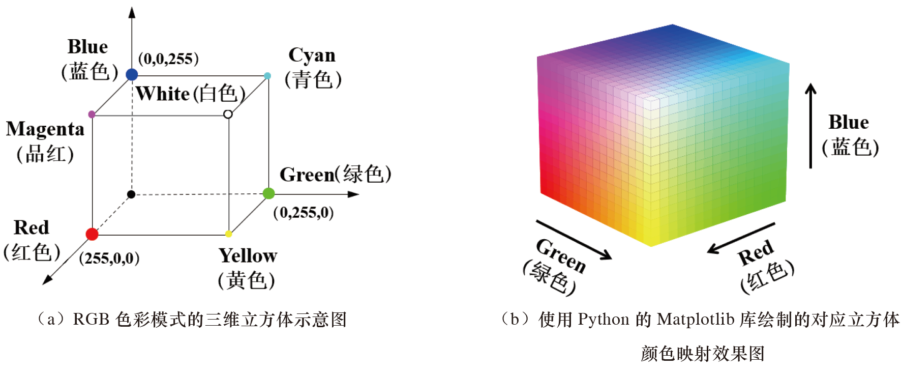
The RGB color mode refers to expressing various colors by mixing the three colors red (Red), green (Green), and blue (Blue). This color mode uses variations in the three red, green, and blue color channels, as well as their superposition with one another, to obtain various color values, and it is currently a widely used color system.
The RGB color mode assigns an intensity value (ranging from 0 to 255) to each R, G, and B component of every pixel in an image. For example, black can be represented as (0,0,0), and white can be represented as (255,255,255). The RGB color mode is represented below in the form of three-dimensional coordinates:
CMYK Color Mode #
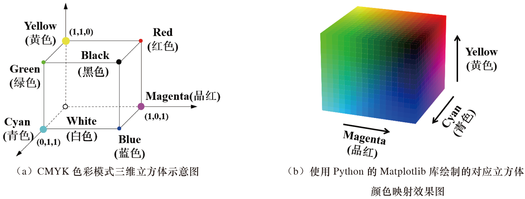
The CMYK color mode can be regarded as a subset of the RGB color mode. It is a four-color model primarily used for color printing, in which C represents cyan (Cyan), M represents magenta (Magenta), Y represents yellow (Yellow), and K represents black (blacK).
The CMYK color mode is a printing color mode and is also a color mode that relies on reflected light. Although the RGB color mode represents more colors, this does not mean that all of them can be printed. In theory, mixing cyan, magenta, and yellow together can produce black. However, according to the current level of manufacturing processes, the actual result obtained after mixing the three is dark red. Therefore, we need to add a dedicated black ink for neutralization, namely using the key plate color (black) (Key Plate (Black)), to ensure that black is output.
Most print journals require images to use the CMYK color mode during the manuscript publication stage. For online versions of journals, we should use the RGB color mode.
HEX Color Mode #
The HEX color mode, also known as the hexadecimal color mode, has a principle similar to that of the RGB color mode: both produce various colors by mixing the three primary colors red, green, and blue. The HEX color mode is often used to represent colors in code, which makes it convenient for us to change colors when using code to draw scientific paper figures.
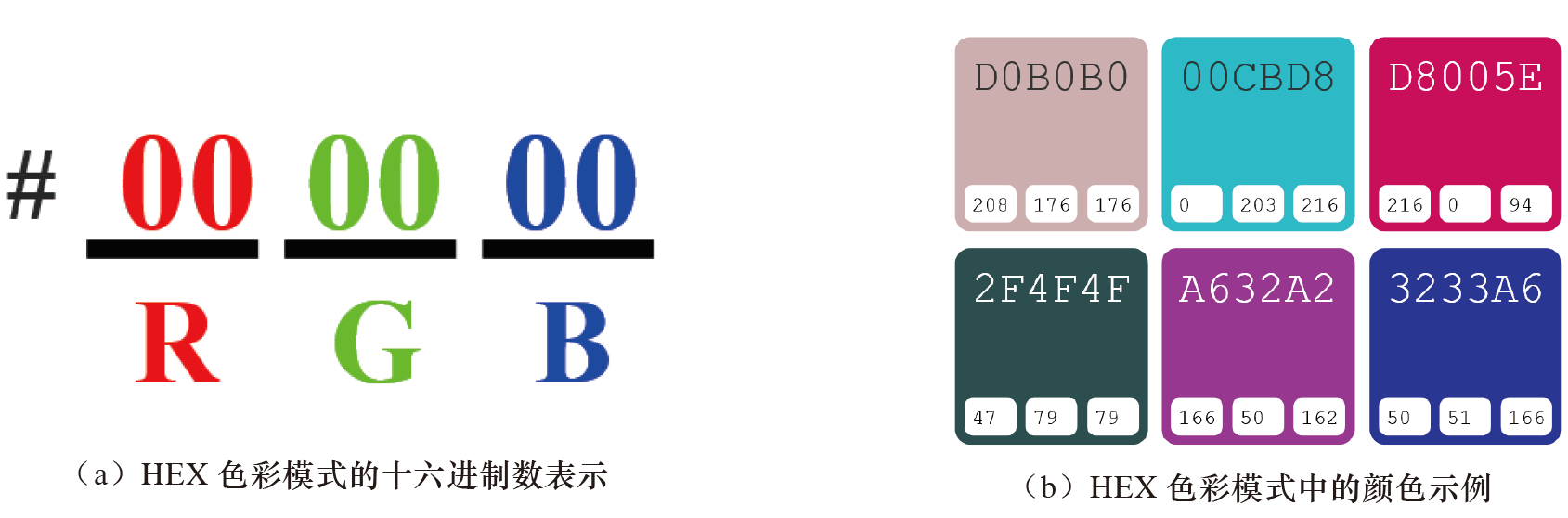
The HEX color mode uses a 6-digit hexadecimal number to represent a color, while R, G, and B in the RGB color mode each use one decimal number. Simply put, the HEX color mode converts each decimal number in the RGB color mode into its corresponding two-digit hexadecimal number for representation, begins with a “#” sign, and orders the three bytes as follows: byte 1 represents the red value (the color type is red), byte 2 represents the green value (the color type is green), and byte 3 represents the blue value (the color type is blue). One byte represents a number in the range 00 to FF.
It should be noted that each byte in the HEX color mode must contain two hexadecimal digits. When conversion from a decimal number (0 to 255) results in only one hexadecimal digit, we should prepend a zero to this hexadecimal number. For example, decimal 0 remains 0 after conversion to hexadecimal, but we must represent it as “00” in the HEX color mode.
For the HEX color mode, its transcoding process (such as converting the RGB color mode to the HEX color mode) may be relatively unfamiliar. You can directly obtain color codes through on-screen color-picking tools such as ColorPix and FastStone, or directly search for the HEX color codes corresponding to different colors through websites such as Encycolorpedia.
Principles of Color-Wheel Color Matching #
A color wheel, also called a color ring, generally consists of 12 basic colors arranged in a circle. It is an artificially specified way of arranging colors. It can not only help users better study the patterns of color transformation and color matching, but also allows users to design color schemes with a personal style themselves.
Common color-wheel color schemes include:
- monochromatic color scheme
- complementary color scheme
- triadic color scheme
- tetradic color scheme, etc.
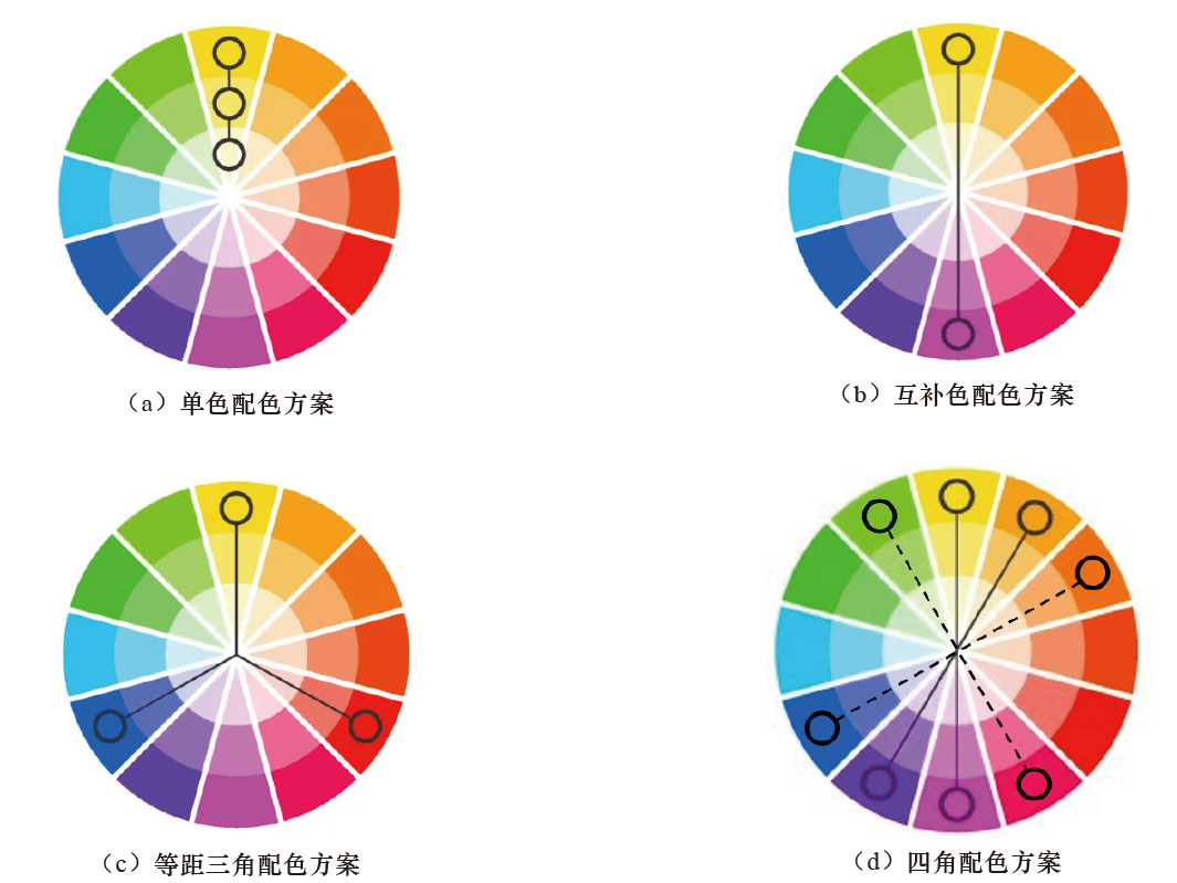
Monochromatic Color Scheme #
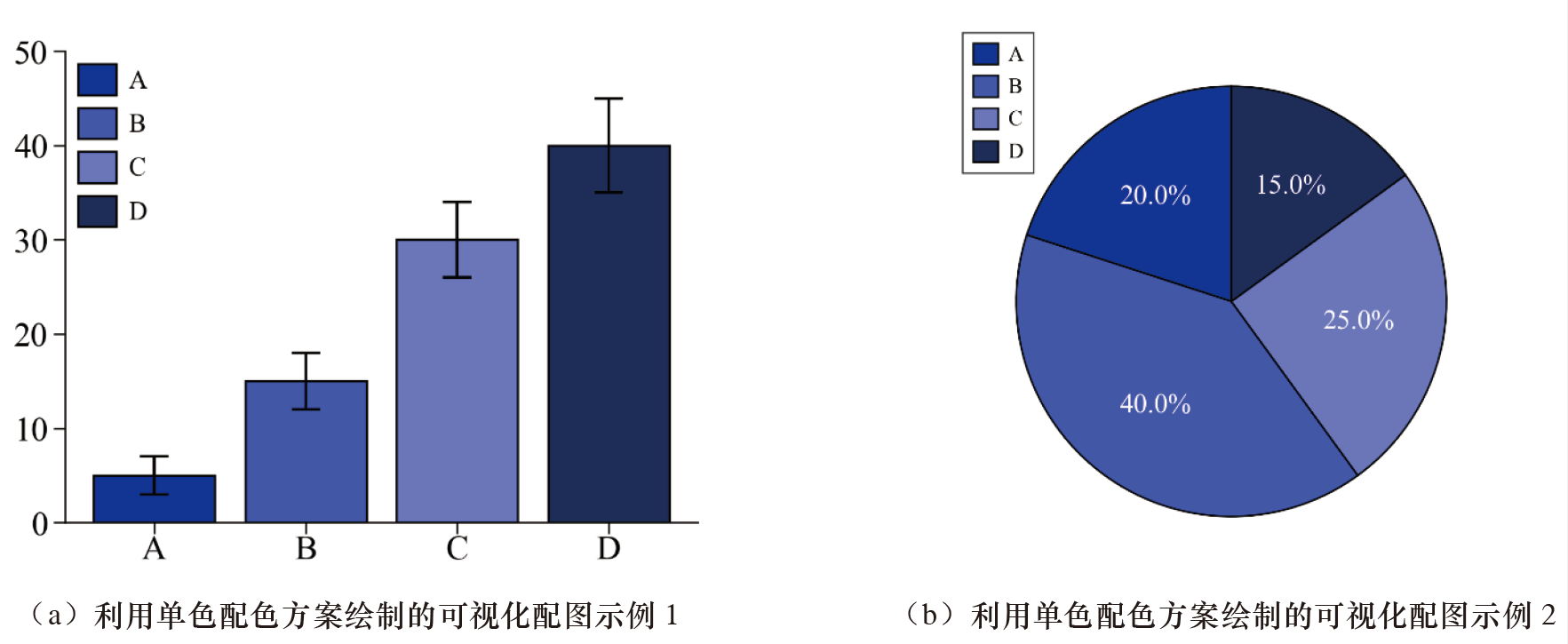
A monochromatic color scheme refers to combining a group of colors with the same or similar hue. A monochromatic color scheme has clear levels of saturation and lightness. In addition, a monochromatic color scheme also has the harmony of the same color family, does not produce overly vivid colors, and ensures balance among the selected colors.
During the process of drawing scientific paper figures, monochromatic color schemes are often used to represent data with a direct relationship, a relatively close relationship, or data from the same series. It should be noted that when selecting colors in a monochromatic color scheme, there should not be too many types; 3 to 5 are relatively appropriate.
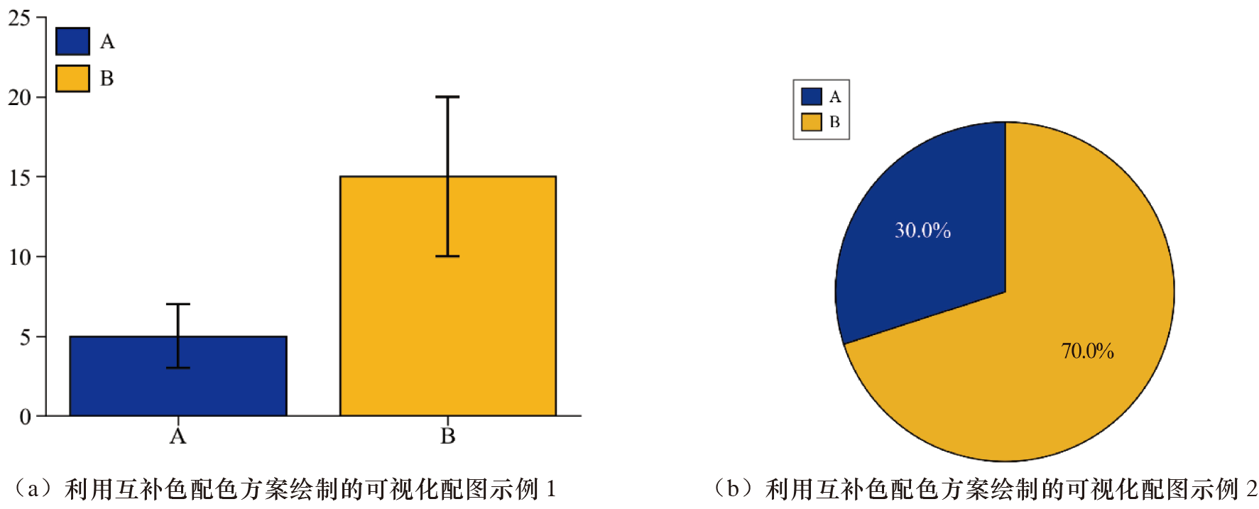
Complementary Color Scheme #
When only two colors can be selected, we can refer to a complementary color scheme when making the selection. Two colors separated by 180° (opposite) on the color wheel are complementary colors. Complementary colors have a strong contrasting effect; therefore, they can be used for the visual expression of observation-group data and control-group data in scientific paper figures.
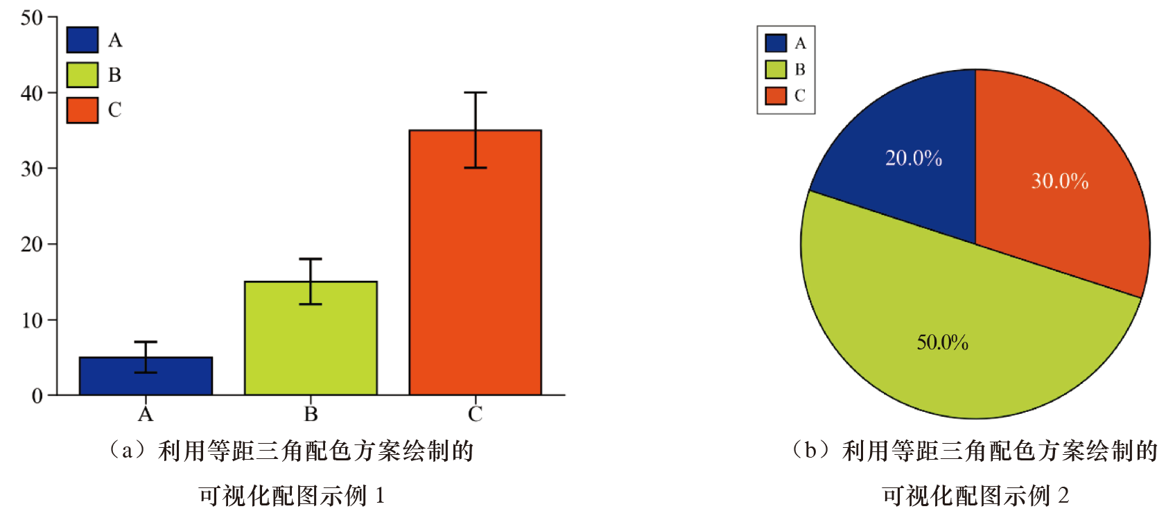
Triadic Color Scheme #
A triadic color scheme refers to combining three colors separated from one another by 120° on the color wheel. A triadic color scheme makes the colors of a figure richer, but it is used less often in the process of drawing scientific paper figures. When using a triadic color scheme, we can select one color as the primary color and use the other two colors as secondary colors.
Tetradic Color Scheme #
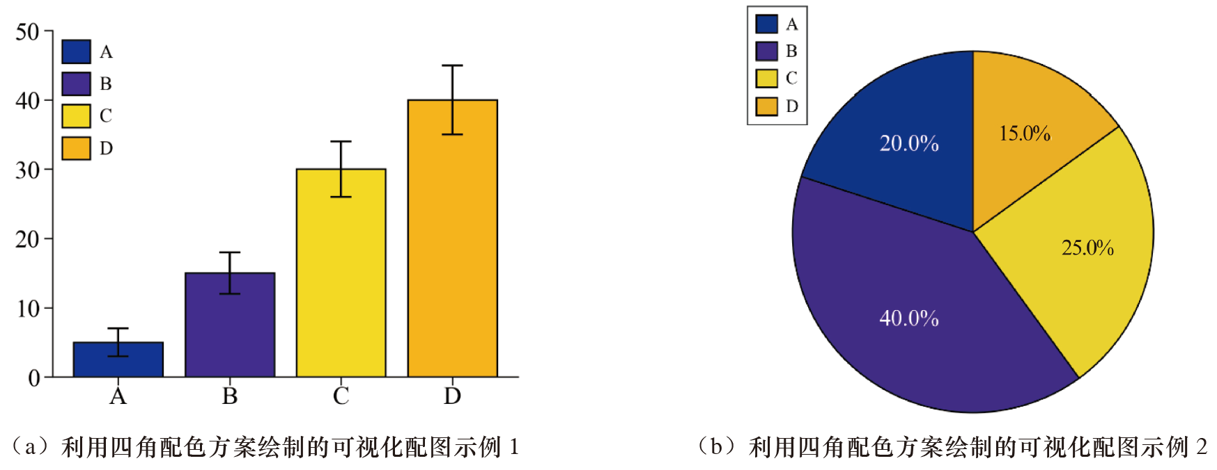
There are two tetradic color schemes. One is a rectangular color scheme composed of two pairs of complementary colors, represented by solid lines in the color-wheel color-matching schematic, and the other is a square color scheme, represented by dashed lines in the color-wheel color-matching schematic. The advantage of a tetradic color scheme is that it can make the colors of a figure richer, while the disadvantage is that it is very challenging to use and can easily result in chaotic colors; many users actually find it difficult to balance the multiple colors they select. During the process of selecting colors for scientific paper figures, we should avoid as much as possible using tetradic color schemes.
Color Themes #
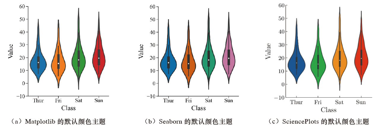
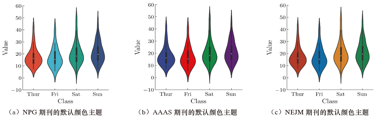
Different plotting tools (such as the commonly used plotting tools Matplotlib and Seaborn in Python) have their own color themes. Color themes are friendly to users (especially beginners), so users do not have to waste a large amount of time choosing color combinations. Some English journals have their own set of color themes, and users only need to change the illustration color matching to the color theme required by the journal when submitting a manuscript.
The visual effects of the default color themes of three plotting tools in Python are shown below.
The visual effects of the default color themes of three journals are shown below.
The color themes of the Matplotlib library mainly include three types:
- sequential
- diverging
- qualitative.
Sequential Color Scheme #
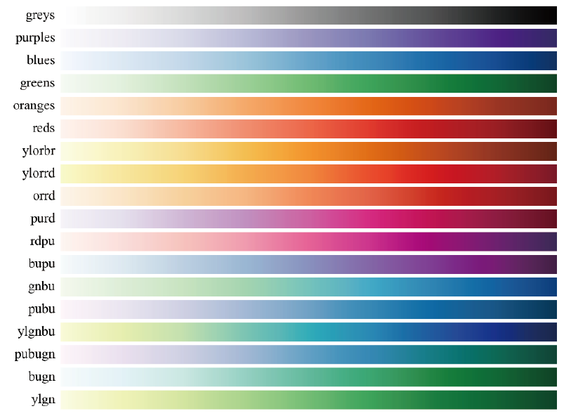
The colors in a sequential theme have basically the same hue, and saturation increases monotonically. Its primary dimension is color lightness. Generally, lower values correspond to lighter colors, while higher values correspond to darker colors. This is because visualization figures are often drawn on white or light-colored backgrounds, while on dark backgrounds, the opposite occurs; that is, brighter colors are represented by higher values.
The secondary dimension of a sequential theme is hue, meaning warmer colors appear at the lighter end, while cooler colors appear at the darker end. For example, changes in population density can be represented using sequential colors.
Below is a schematic of some sequential color themes in the Matplotlib library.
Diverging Color Scheme #
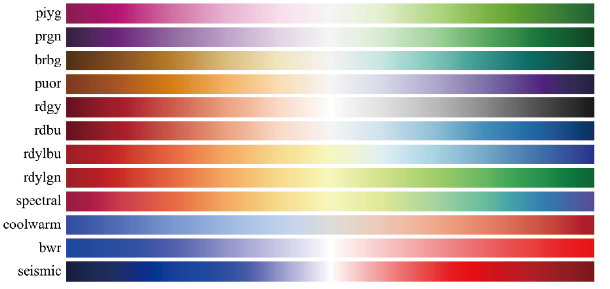
Diverging color themes are mainly used for numerical variables that have a critical central value (midpoint). They are essentially a combination of two continuous sequential color schemes, using the critical central value as the midpoint, generally represented in white. Values greater than the central value are assigned colors on one side of the midpoint, while values less than the central value are assigned colors on the other side of the midpoint. In addition, we can judge through the lightness or darkness of colors: the central value is usually designated as a light color, and the farther away from the center point, the darker the color.
Below is a schematic of diverging color themes in the Matplotlib library.
Qualitative Color Scheme #
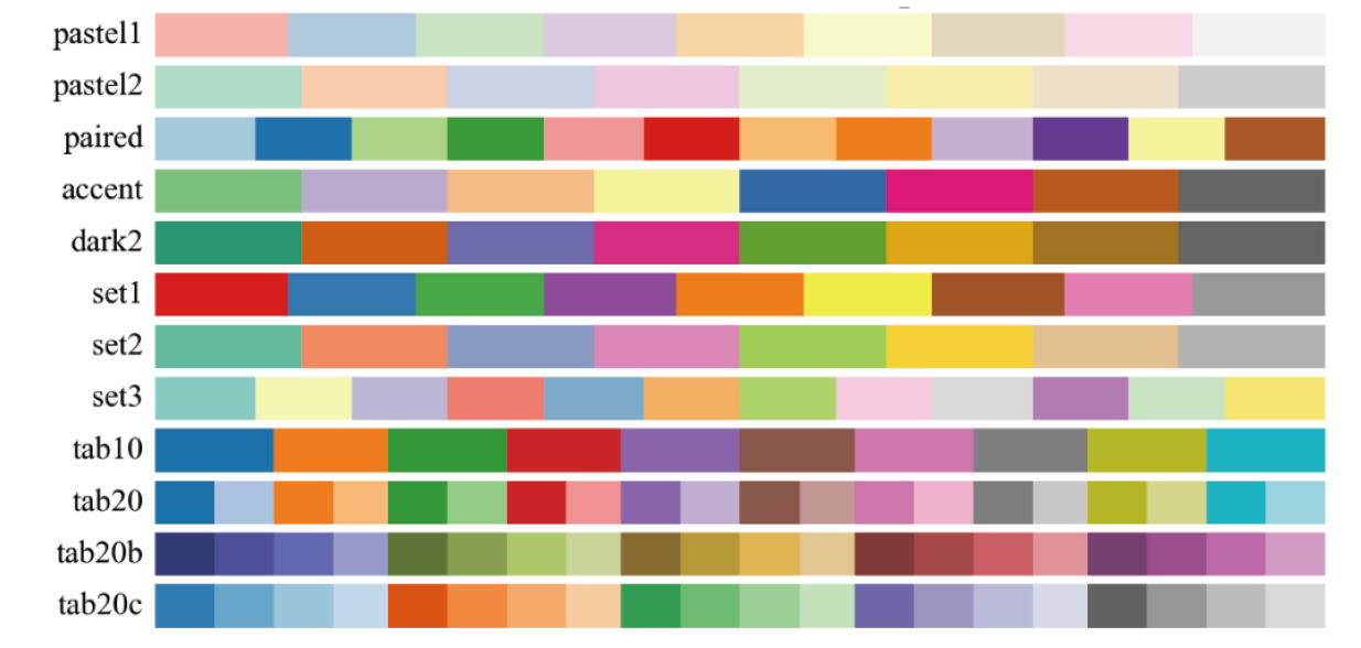
When the represented data are categorical values (categorical variables), we can use a qualitative color theme. During the use of a qualitative color theme, each group needs to be assigned a different color.
Generally, you can try to set the number of color categories in a color theme to 10 or fewer, while using too many color categories may cause grouping confusion and result in a cluttered visual effect. When the existing color categories cannot cover all values, a certain value category can be combined together to form a single other category.
Below is a schematic of some qualitative color themes in the Matplotlib library.
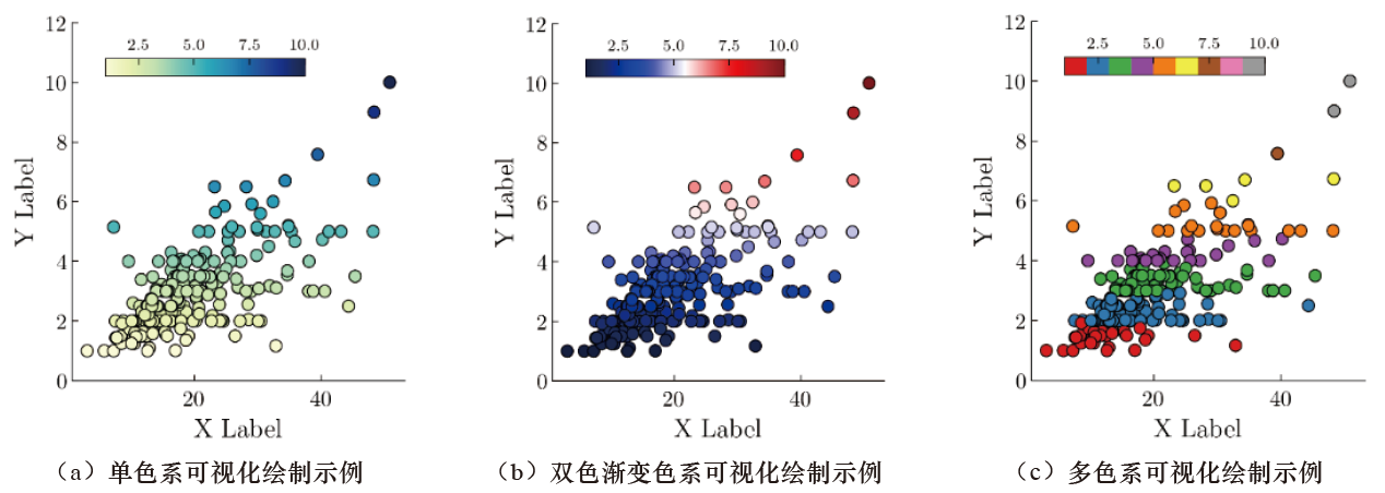
The figure below shows examples of sequential, diverging, and qualitative visualization figures drawn using the Tips dataset in the Seaborn library, specifically the ylgnbu color scheme among sequential schemes, the seismic color scheme among diverging schemes, and the set1 color scheme among qualitative schemes.
Color-Matching Tools #
To efficiently select suitable color combinations for scientific paper figures, in addition to using the color themes built into plotting tools, we can also use some excellent color-matching tools. Through color-matching tools, we can perform flexible color matching. Commonly used color-matching tools include the advanced online color matcher on the Color Scheme Designer website, Adobe’s online color-matching tool Adobe Color, and the color-theme matching website ColorBrewer 2.0.
Advanced Online Color Matcher on the Color Scheme Designer Website #
The advanced online color matcher on the Color Scheme Designer website is a free online color-matching tool that primarily selects color combinations for users in the form of a color ring (color wheel), including six color-wheel color schemes: monochromatic matching, complementary-color matching, triangular matching, rectangular matching, analogous-color matching, and “analogous-color matching plus complementary color.”
Adobe Color #
Adobe Color is a free online color-scheme tool officially launched by Adobe. It provides multiple features such as color-matching modes, image color picking, and extraction of image gradient colors. Here, Adobe Color’s color-wheel color-matching tool is mainly introduced. It provides nine intelligent color-adjustment modes and one custom mode, and supports the RGB, HSB, and LAB color modes.
ColorBrewer 2.0 #
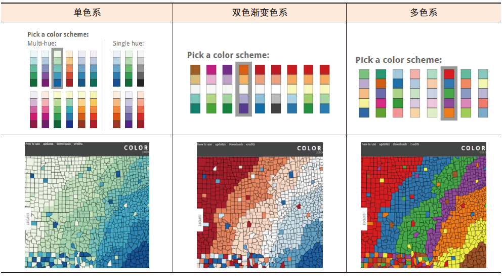
ColorBrewer 2.0 is a professional online color-scheme website that provides a large number of color-matching themes. These themes are built-in plotting color themes in many plotting tools (such as Matplotlib and ggplot 2). The color themes provided by ColorBrewer 2.0 include sequential, diverging, and qualitative color schemes.
The selection and preview effects of the color schemes corresponding to three color themes in ColorBrewer 2.0 are shown below.
Python’s Matplotlib library and R’s RColorBrewer package contain almost all the color themes from ColorBrewer 2.0, allowing users to conveniently select colors when creating visualization works. When using the Matplotlib library, users can directly set the plotting color theme through the cmap parameter of a plotting function.
Related readings
- Plotting Tools and Their Key Features
- Overview of the AI Development Software Environment
- Image Classification and Foundational Vision Models
If you want to follow my updates, or have a coffee chat with me, feel free to connect with me: