Density Plotting
August 31, 2023 · 13 min read
If you have any questions, feel free to comment below. Click the block can copy the code.
And if you think it's helpful to you, just click on the ads which can support this site. Thanks!
Seaborn’s kdeplot() function is one way to draw density plots in Python. At present, Matplotlib does not have a specific function for drawing density plots, and plotting is generally performed in combination with the result of the gaussian_kde() function in the Scipy library.
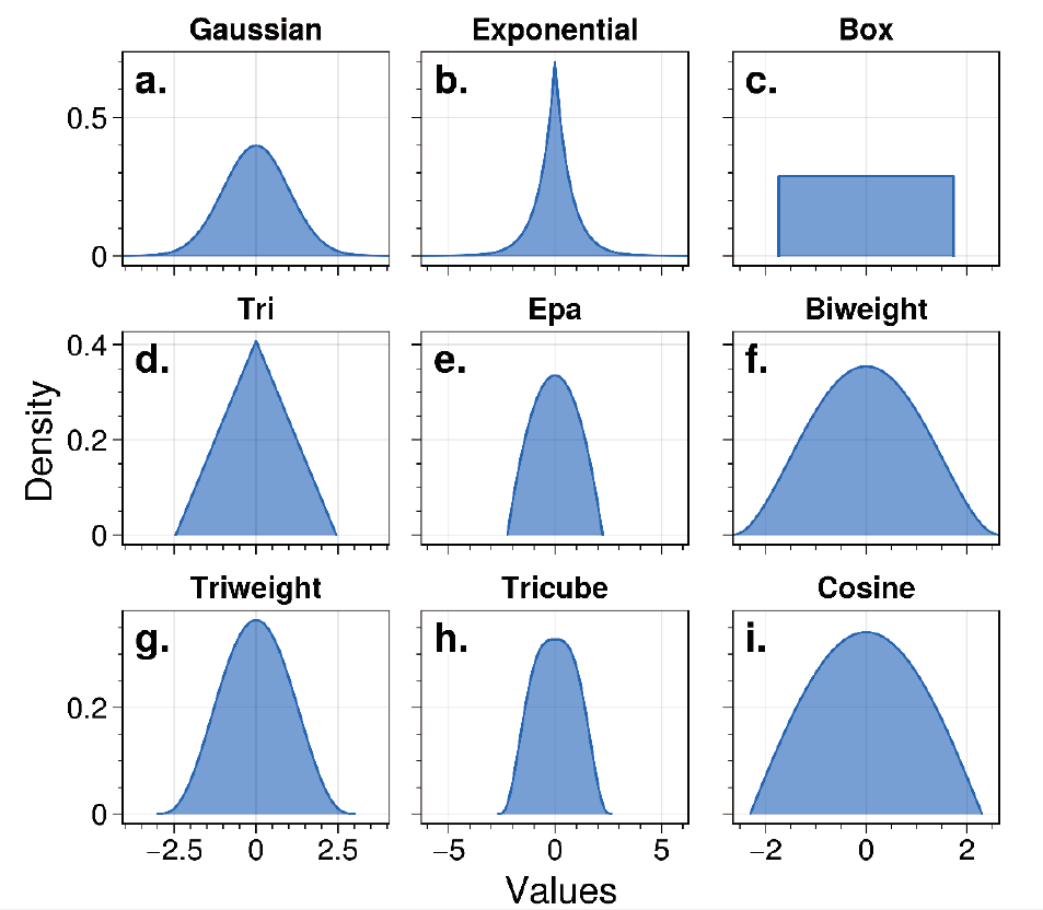
The neighbors.KernelDensity () module in Python’s scikit-learn library provides six kernel functions—Gaussian, Tophat, Epanechnikov, Exponential, Linear, and Cosine—for kernel density estimation calculations. Python’s KDEpy library provides as many as nine kernel functions, including Gaussian, Exponential, Box, Tri, Epa, Biweight, Triweight, Tricube,
Cosine.
A schematic diagram of the nine kernel functions in the KDEpy library is shown below:
Comparison of 3 Methods for Drawing Density Plots #
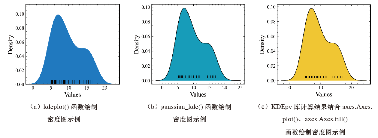
Below, density plots are drawn separately using three methods: the kdeplot () function in Seaborn, the gaussian_kde () function in the Scipy library, and the calculation results of the KDEpy library combined with the axes.Axes.Plot() and axes.Axes.Fill () functions in Matplotlib.
import numpy as np
import pandas as pd
import seaborn as sns
import matplotlib.pyplot as plt
plt.rcParams["font.family"] = "Times New Roman"
plt.rcParams["xtick.minor.visible"] = True
plt.rcParams["ytick.minor.visible"] = True
plt.rcParams["xtick.direction"] = "in"
plt.rcParams["ytick.direction"] = "in"
plt.rcParams["xtick.labelsize"] = 12
plt.rcParams["ytick.labelsize"] = 12

#Build the dataset
data_01 = [5.1,5.2,5.3,5.4,5.5,6.0,6.2,6.3,6.4,6.5,
           7.0,7.5,8.0,8.5,8.8,8.9,9.0,9.5,10,11,
           11.5,12,13,14,14.5,15,15.5,16,16.5,17]

data_02 = [5.1,5.2,5.3,5.4,5.5,6.0,7.0,7.3,7.4,7.5,
           8.0,8.2,8.4,8.6,8.8,9.0,9.2,9.4,9.6,9.8,
           10,10.2,11,11.5,12,12.5,13,13.5,15,16]
data_03 = [5.1,5.2,5.3,5.4,5.6,6.0,6.1,6.2,6.4,6.8,
           7.1,8.2,8.8,9.0,9.2,10.2,10.4,10.8,11,11.6,
           12,12.4,12.6,12.8,13,13.2,13.4,13.6,13.7,13.8]

data_04 = [5.0,5.2,5.3,5.4,5.6,5.8,6.0,6.2,6.4,6.6,
             6.8,7.0,7.2,7.4,7.6,8.0,9.0,9.2,9.6,9.8,
             10,10.3,11,12,16,16,18,18.5,19,22]
data_df = pd.DataFrame({"data_01":data_01,"data_02":data_02,
                        "data_03":data_03,"data_04":data_04})


#(a) Example of drawing a density plot with the kdeplot() function
fig,ax = plt.subplots(figsize=(4,3.5),dpi=100,facecolor="w")
kde_01 = sns.Kdeplot (x="data_01", data=data_df, color=" #1180D5 ", alpha=1, shade=True, ax=ax)
Sns.Rugplot (data=data_df, x="data_01", color='k', height=. 05, ax=ax)
Ax. Set_xlabel ("Values")
Ax. Set_ylabel ("Density")

Plt.Show ()

#(b) Example of drawing a density plot with the gaussian_kde () function
From scipy import stats
Density = stats. Kde. Gaussian_kde (data_01)
X = np.Linspace (-2,25,500)
Y = density (x)

Fig, ax = plt.Subplots (figsize=(4,3.5), dpi=100, facecolor="w")
Ax.Plot (x, y, lw=1, color="k")
ax.Fill (x, y, color=" #07A6C5 ")
# Add individual data
Ax.Plot (data_01, [0.005]*len (data_01), '|', color='k', lw=1)
Ax. Set_xlabel ("Values")
Ax. Set_ylabel ("Density")
Plt.Show ()

#(c) Example of drawing a density plot by combining KDEpy library calculation results with the axes.Axes.Plot () and axes.Axes.Fill () functions
From KDEpy import FFTKDE
X, y = FFTKDE (kernel="gaussian", bw=2). Fit (data_01). Evaluate ()

Fig, ax = plt.Subplots (figsize=(4,3.5), dpi=100, facecolor="w")
Ax.Plot (x, y, lw=1, color="k",)
ax.Fill (x, y, color=" #FBCD2D ")
# Add individual data,
Ax.Plot (data_01, [0.005]*len (data_01), '|', color='k', lw=1)
Ax. Set_xlabel ("Values")
Ax. Set_ylabel ("Density")
Plt.Show ()
Drawing a density plot using the kdeplot () function in Seaborn is relatively simple. Combined with the rugplot () function, it can draw the data distribution along the X axis. The other two methods are somewhat more troublesome than the kdeplot () function, but the density plots drawn by these two methods are clearer.
Note that the kernel density estimation results here are all obtained through the Gaussian kernel function.
Multiple Data Groups, the Same Kernel Function #
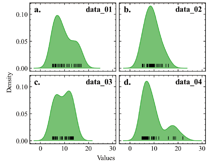
For multiple groups of sample data with different numerical distributions, we often use the same kernel function to fit them and draw the results as density plots. This situation generally occurs during the data exploration stage, and the methods above are often used to view the distribution of data in each dimension or compare differences between different data.
Below is a kernel density plot drawn with Matplotlib using the same kernel function for multiple groups of sample data, showing the distributions of different data.
import numpy as np
import pandas as pd
import seaborn as sns
import matplotlib.pyplot as plt
plt.rcParams["font.family"] = "Times New Roman"
plt.rcParams["xtick.minor.visible"] = True
plt.rcParams["ytick.minor.visible"] = True
plt.rcParams["xtick.direction"] = "in"
plt.rcParams["ytick.direction"] = "in"
plt.rcParams["xtick.labelsize"] = 12
plt.rcParams["ytick.labelsize"] = 12

#Build the dataset
data_01 = [5.1,5.2,5.3,5.4,5.5,6.0,6.2,6.3,6.4,6.5,
           7.0,7.5,8.0,8.5,8.8,8.9,9.0,9.5,10,11,
           11.5,12,13,14,14.5,15,15.5,16,16.5,17]

data_02 = [5.1,5.2,5.3,5.4,5.5,6.0,7.0,7.3,7.4,7.5,
           8.0,8.2,8.4,8.6,8.8,9.0,9.2,9.4,9.6,9.8,
           10,10.2,11,11.5,12,12.5,13,13.5,15,16]
data_03 = [5.1,5.2,5.3,5.4,5.6,6.0,6.1,6.2,6.4,6.8,
           7.1,8.2,8.8,9.0,9.2,10.2,10.4,10.8,11,11.6,
           12,12.4,12.6,12.8,13,13.2,13.4,13.6,13.7,13.8]

data_04 = [5.0,5.2,5.3,5.4,5.6,5.8,6.0,6.2,6.4,6.6,
             6.8,7.0,7.2,7.4,7.6,8.0,9.0,9.2,9.6,9.8,
             10,10.3,11,12,16,16,18,18.5,19,22]
data_df = pd.DataFrame({"data_01":data_01,"data_02":data_02,
                        "data_03":data_03,"data_04":data_04})


nrow = 2
ncol = 2
ax_label = ["a.","b.","c.","d."]
titles = ["Type One","Type Two","Type Three","Type Four"]
indexs = [i for i in data_df.columns]

fig,axs = plt.subplots(nrow,ncol,figsize=(5,4),dpi=100,facecolor="w",sharey=True,sharex=True,
                      constrained_layout=True)
for ax, index,label in zip(axs.flat, indexs,ax_label):
    x,y = NaiveKDE(kernel="Gaussian",bw=2).fit(data_df[index].values).evaluate()
    ax.plot(x,y, lw=1,color="#1BB71B")
    ax.fill(x,y,color="#1BB71B",alpha=.6)
    # Add individual data,
    ax.plot(data_df[index].values, [0.005]*len(data_df[index].values), '|', color='k',lw=1)
    ax.text(0.05, 0.95, label, transform=ax.transAxes,fontsize=16, fontweight='bold', va='top')
    ax.text(0.65, 0.95, index,transform=ax.transAxes,fontsize=14, fontweight='bold', va='top')
fig.supxlabel('Values')
fig.supylabel('Density')
plt.show()
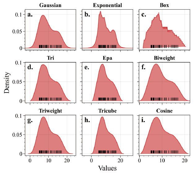
The operation of calculating and drawing kernel density plot results by using different kernel functions for the same group of sample data is more inclined toward studying different kernel functions, and the content involved is very singular.
The figure below shows the kernel density plot results drawn using different kernel functions for the same group of data.
import numpy as np
import pandas as pd
import seaborn as sns
import proplot as pplt
from KDEpy import NaiveKDE
import matplotlib.pyplot as plt
from proplot import rc

rc["axes.labelsize"] = 15
rc['tick.labelsize'] = 12
rc["suptitle.size"] = 16
rc["font.family"] = "Times New Roman"

kde_kernels = NaiveKDE._available_kernels.keys()
fig, axs = pplt.subplots(ncols=3, nrows=3,refwidth=1.5,refheight=1.2)
axs.format(
    abc='a.', abcloc='ul',abcsize=15,
    xlabel='Values', ylabel='Density',
)
for ax, kernel in zip(axs,kde_kernels):
    x,y = NaiveKDE(kernel=kernel,bw=2).fit(data_01).evaluate()
    ax.plot(x,y, lw=1,color="#DB3132")
    ax.fill(x,y,color="#DB3132",alpha=.6)
    # Add individual data,
    ax.plot(data_01, [0.005]*len(data_01), '|', color='k',lw=.5)
    ax.format(title=str.capitalize(kernel),titleweight='bold',titlesize=12)
plt.show()
Gradient Color Fill #
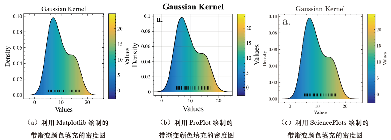
For a better visual effect, color mapping needs to be applied to the original data values used to draw the density plot; that is, a continuous gradient color bar is used to represent specific plotting values, and the corresponding colors fill the area within the density plot curve. Here, this effect needs to be implemented through a custom plotting method.
The figure below shows density plots filled with gradient color drawn using the Matplotlib, ProPlot, and SciencePlots libraries, respectively.
import numpy as np
import pandas as pd
from KDEpy import FFTKDE
from colormaps import parula

#Build the dataset
data_01 = [5.1,5.2,5.3,5.4,5.5,6.0,6.2,6.3,6.4,6.5,
           7.0,7.5,8.0,8.5,8.8,8.9,9.0,9.5,10,11,
           11.5,12,13,14,14.5,15,15.5,16,16.5,17]


#(a) Density plot with gradient color fill drawn using Matplotlib
import matplotlib.pyplot as plt
from matplotlib.axes import Axes

plt.rcParams["font.family"] = "Times New Roman"
plt.rcParams["axes.linewidth"] = 1
plt.rcParams["axes.labelsize"] = 15
plt.rcParams["xtick.minor.visible"] = True
plt.rcParams["ytick.minor.visible"] = True
plt.rcParams["xtick.direction"] = "in"
plt.rcParams["ytick.direction"] = "in"
plt.rcParams["xtick.labelsize"] = 12
plt.rcParams["ytick.labelsize"] = 12
plt.rcParams["xtick.top"] = False
plt.rcParams["ytick.right"] = False

x, y = FFTKDE(kernel="gaussian", bw=2).fit(data_01).evaluate()
img_data = x.reshape(1, -1)

cmap = parula
fig,ax = plt.subplots(figsize=(4,3.5),dpi=100,facecolor="w")
ax.plot(x,y, lw=1,color="k")
# Add individual data,
ax.plot(data_01, [0.005]*len(data_01), '|', color='k',lw=1)
#ax.tick_params(which="both",direction='in')
ax.set_xlabel("Values")
ax.set_ylabel("Density")
ax.set_title("Gaussian Kernel",size=15)

extent=[*ax.get_xlim(), *ax.get_ylim()]
im = Axes.imshow(ax, img_data, aspect='auto',cmap=cmap,extent=extent)
fill_line,= ax.fill(x, y,facecolor='none')
im.set_clip_path(fill_line)
colorbar = fig.colorbar(im,ax=ax,aspect=12,label="Values")
#colorbar.ax.tick_params(which="both",direction='in')
#colorbar.ax.set_title("Values",fontsize=10)

plt.show()

#(b) Density plot with gradient color fill drawn using ProPlot

from colormaps import parula
#from matplotlib.axes import Axes
from proplot.axes import Axes
from proplot import rc

rc["font.family"] = "Times New Roman"
rc["axes.labelsize"] = 15
rc['tick.labelsize'] = 10
rc["suptitle.size"] = 16

x, y = FFTKDE(kernel="gaussian", bw=2).fit(data_01).evaluate()
img_data = x.reshape(1, -1)

cmap = parula
fig = pplt.figure(suptitle="Gaussian",figsize=(3.5,3))
ax = fig.subplot(xlabel='x axis', ylabel='y axis')
ax.format(abc='a.', abcloc='ul',abcsize=16,
          xlabel='Values', ylabel='Density',
          suptitle='Gaussian Kernel')
ax.plot(x,y, lw=1,color="k")
# Add individual data,
ax.plot(data_01, [0.005]*len(data_01), '|', color='k',lw=1)
fill_line,= ax.fill(x, y,facecolor='none')
extent=[*ax.get_xlim(), *ax.get_ylim()]
im = Axes.imshow(ax, img_data, aspect='auto',cmap=cmap,extent=extent)
im.set_clip_path(fill_line)
fig.colorbar(im,title="Values",tickminor=True,tickdirection="in")

plt.show()

#(c) Density plot with gradient color fill drawn using SciencePlots

from KDEpy import NaiveKDE
from colormaps import parula
from matplotlib.axes import Axes

customer_ages = [5.1,5.2,5.3,5.4,5.5,6.0,6.2,6.3,6.4,6.5,
                 7.0,7.5,8.0,8.5,8.8,8.9,9.0,9.5,10,11,
                 11.5,12,13,14,14.5,15,15.5,16,16.5,17]
x, y = NaiveKDE(kernel="gaussian",bw=2).fit(customer_ages).evaluate()
img_data = x.reshape(1, -1)
cmap = parula

from matplotlib.axes import Axes
with plt.style.context(['science']):
    fig,ax = plt.subplots(figsize=(4,3.5),dpi=100,facecolor="w")
    ax.plot(x,y, lw=1,color="k")
    # Add individual data,
    ax.plot(data_01, [0.005]*len(data_01), '|', color='k',lw=1)
    #ax.tick_params(which="both",direction='in')
    ax.set_xlabel("Values")
    ax.set_ylabel("Density")
    ax.set_title("Gaussian Kernel",size=15)
    ax.text(.05,.88,"a.",transform=ax.transAxes,fontsize=25,fontweight="bold")
    extent=[*ax.get_xlim(), *ax.get_ylim()]
    im = Axes.imshow(ax, img_data, aspect='auto',cmap=cmap,extent=extent)
    fill_line,= ax.fill(x, y,facecolor='none')
    im.set_clip_path(fill_line)
    colorbar = fig.colorbar(im,ax=ax,aspect=12,label="Values")
plt.show()
It should be noted that the continuous fill color scheme here is the custom parula color scheme (MATLAB’s classic color scheme). Simply add the colormaps.py file to the current plotting environment to import the defined parula color scheme.
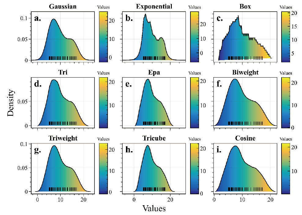
For the cases of “multiple data groups, the same kernel function” or “the same data group, different kernel functions,” the methods for drawing their color-filled density plots are the same as for the same group of data.
The figure below is a gradient color-filled density plot corresponding to the “same data group, different kernel functions” case drawn using the ProPlot library.
from colormaps import parula
from proplot.axes import Axes
from KDEpy import NaiveKDE
from proplot import rc

rc["font.family"] = "Times New Roman"
rc["axes.labelsize"] = 15
rc['tick.labelsize'] = 10
rc["suptitle.size"] = 16


data_01 = [5.1,5.2,5.3,5.4,5.5,6.0,6.2,6.3,6.4,6.5,
                 7.0,7.5,8.0,8.5,8.8,8.9,9.0,9.5,10,11,
                 11.5,12,13,14,14.5,15,15.5,16,16.5,17]


cmap = parula
kde_kernels = NaiveKDE._available_kernels.keys()
fig, axs = pplt.subplots(ncols=3, nrows=3,refwidth=1.5,refheight=1.2)
axs.format(
    abc='a.', abcloc='ul',abcsize=16,
    xlabel='Values', ylabel='Density',
)
for ax, kernel in zip(axs,kde_kernels):
    x,y = NaiveKDE(kernel=kernel,bw=2).fit(data_01).evaluate()
    img_data = x.reshape(1, -1)
    ax.plot(x,y, lw=1,color="k")
    fill_line,= ax.fill(x, y,facecolor='none')
     # Add individual data,
    ax.plot(data_01, [0.005]*len(data_01), '|', color='k',lw=.5)
    ax.format(title=str.capitalize(kernel),titleweight='bold',titlesize=12)

    extent=[*ax.get_xlim(), *ax.get_ylim()]
    im = Axes.imshow(ax, img_data, aspect='auto',cmap=cmap,extent=extent)
    im.set_clip_path(fill_line)
    colorbar = fig.colorbar(im,tickminor=True,tickdirection="in",ax=ax)
    colorbar.ax.set_title("Values",fontsize=8)
plt.show()
“Ridgeline” Plot #
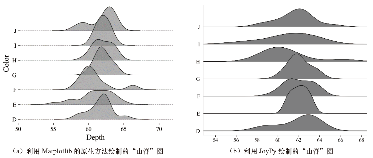
When drawing density plots for multiple groups of data, in addition to using subplots to draw each group of data as described above, we can also stack the plotting results of multiple data groups, that is, represent them using a “ridgeline” plot (ridgeline chart).
A “ridgeline” plot is usually used to represent differences in the distributions of different categories of data for the same factor. In Matplotlib, we can use Matplotlib’s “native” method to draw a “ridgeline” plot, or we can use the JoyPy library to draw it.
sord_index = [i for i in group_data.color.unique()]
sord_index = sorted(sord_index, key=str.lower)
fig,ax = plt.subplots(figsize=(5.5,4.5), dpi=100)
for i,index in zip(range(len(sord_index)), sord_index):
	data = group_data.loc[group_data["color"]==index, "depth"].values
	x,y = NaiveKDE(kernel="Gaussian", bw=.8).fit(data).evaluate()
	ax.plot(x, 6*y+i, lw=.6, color="k", zorder=100-i)
	ax.fill(x, 6*y+i, lw=1, color="gray", alpha=.6, zorder=100-i)
	ax.grid(which="major", axis="y", ls="--", lw=.7, color="gray", zorder=-1)
	ax.yaxis.set_tick_params(labelleft=True)
	ax.set_yticks(np.arange(len(sord_index)))
	ax.set_yticklabels(sord_index)
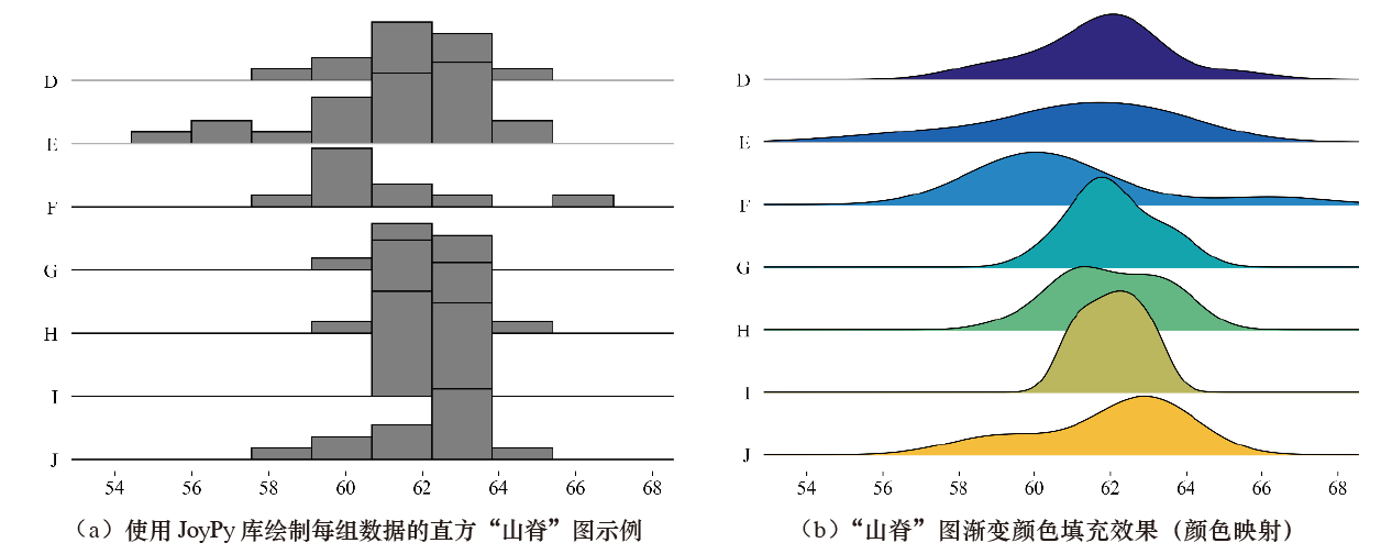
We can use the JoyPy library to draw a histogram “ridgeline” plot for each group of data by setting the hist parameter in the joyplot() function to True. We can also apply color mapping to the “ridgeline” plot by setting the colormap parameter.
# Draw the histogram "ridgeline" plot
fig, axes = joypy.joyplot(group_data, by="color",
	column="depth", labels=sord_index, grid="y",
	linewidth=1, figsize=(7,6), color="gray",
	hist=True, xlabelsize=15, ylabelsize=15)
# Draw the gradient color-filled "ridgeline" plot
from colormaps import parula
fig, axes = joypy.joyplot(group_data, by="color",
	column="depth", labels=sord_index, grid="y",
	linewidth=1, figsize=(7,6), hist=False,
	colormap=parula, xlabelsize=15, ylabelsize=15)
Because the functionality of the JoyPy library is not yet sufficiently complete, readers are advised to use Matplotlib’s native method to draw “ridgeline” plots.
If you want to use continuous gradient colors to fill each group of data in a “ridgeline” plot and use continuous gradient color values to represent data magnitude, you can refer to the method for drawing a gradient color-filled density plot.
It should be noted that because the plotting script involves loop plotting statements, a clipping failure problem will occur when saving it as a vector file (such as a PDF file). To solve this problem, we only need to add the following code before writing the script.
# The following setting is required when saving multiple plotting objects as a PDF file
plt.rcParams["image.composite_image"] = False
The figure below is a gradient color-filled “ridgeline” plot drawn using Matplotlib. Figure (a) uses the “plasma” color mapping style, and Figure (b) uses the “parula” color mapping style. Different colors represent different variable (Depth) values.
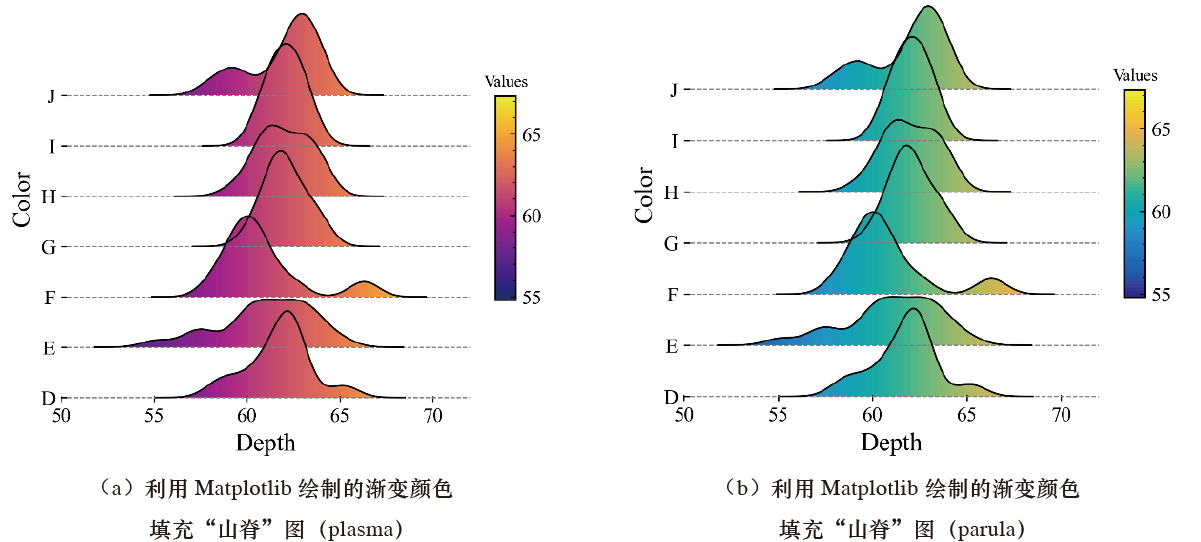
# The following setting is required when saving multiple plotting objects as a PDF file
plt.rcParams["image.composite_image"] = False
fig,ax = plt.subplots(figsize=(5.5, 4.5), dpi=100)
for i,index in zip(range(len(sord_index)), sord_index):
	data = group_data.loc[group_data["color"]
		==index,"depth"].values
	x,y = NaiveKDE(kernel="Gaussian", bw=.8).
		fit(data).evaluate()
	img_data = x.reshape(1, -1)
	ax.plot(x,6*y+i, lw=1, color="k", zorder=100-i)
	fill_line, = ax.fill(x, 6*y+i, facecolor="none")
	ax.grid(which="major", axis="y", ls="--",
		lw=.7, color="gray", zorder=-1)
	ax.set_xlim(50,72)
	ax.yaxis.set_tick_params(labelleft=True)
	ax.set_yticks(np.arange(len(sord_index)))
	ax.set_yticklabels(sord_index)
	ax.set_xlabel("Depth")
	ax.set_ylabel("Color")
	ax.tick_params(which ="both",top=False,right=False)
	ax.tick_params(which = "minor", axis="both", left=False,
		bottom=False)
for spin in ["top", "right", "bottom", "left"]:
	ax.spines[spin].set_visible(False)
	extent=[*ax.get_xlim(), *ax.get_ylim()]
	im = Axes.imshow(ax, img_data, aspect='auto',
		cmap="plasma", extent=extent)
	im.set_clip_path(fill_line)
colorbar = fig.colorbar(im, aspect=10, shrink=0.5)
colorbar.ax.set_title("Values", fontsize=10)
Gradient color-filled “ridgeline” plots drawn using the ProPlot and SciencePlots libraries, respectively.
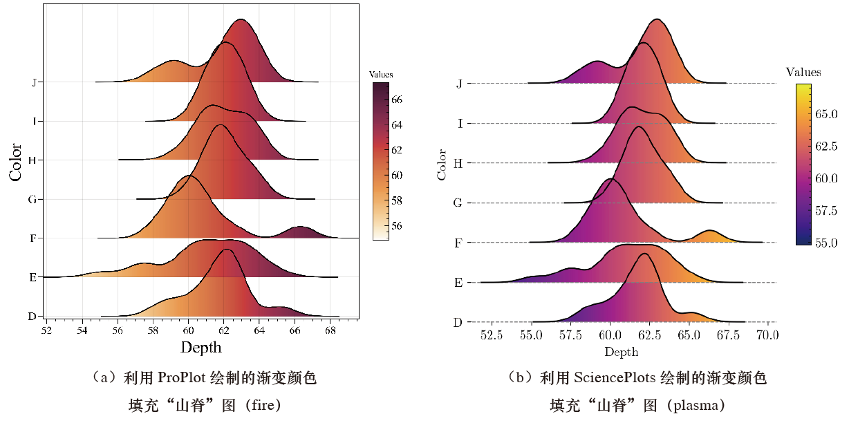
import pandas as pd
import numpy as np
import proplot as pplt

group_data = pd.read_csv(r"第3章 单变量图形的绘制\山脊图绘制数据.csv")
sord_index = [i for i in group_data.color.unique()]
sord_index = sorted(sord_index,key=str.lower)


# a) Gradient color-filled “ridgeline” plot drawn using ProPlot (fire)
from proplot.axes import Axes
from proplot import rc
rc["font.family"] = "Times New Roman"
rc["axes.labelsize"] = 15
rc['tick.labelsize'] = 10
rc["suptitle.size"] = 16
rc["image.composite_image"] = False

fig = pplt.figure(figsize=(5.,4.5))
ax = fig.subplot()
ax.format(xlabel='Depth', ylabel='Color',ytickminor=False)
for i,index in zip(range(len(sord_index)),sord_index):
    data = group_data.loc[group_data["color"]==index,"depth"].values
    x,y = NaiveKDE(kernel="Gaussian",bw=.8).fit(data).evaluate()
    img_data = x.reshape(1,-1)
    ax.plot(x,6*y+i, lw=1,color="k",zorder=100 - i)
    fill_line, = ax.fill(x,6*y+i,facecolor="none")
    ax.yaxis.set_tick_params(labelleft=True)
    ax.set_yticks(np.arange(len(sord_index)))
    ax.set_yticklabels(sord_index)

    extent=[*ax.get_xlim(), *ax.get_ylim()]
    #im = Axes.imshow(ax, img_data, aspect='auto',cmap=cmap,extent=extent) Fire
    im = Axes.imshow(ax, img_data, aspect='auto',cmap="Fire",extent=extent)
    im.set_clip_path(fill_line)

colorbar = fig.colorbar(im,tickminor=True,tickdirection="in",length=.5,width=.2)
colorbar.ax.set_title("Values",fontsize=8)
plt.show()

#b) Gradient color-filled “ridgeline” plot drawn using SciencePlots (plasma)

from matplotlib.axes import Axes
# A setting is required to save multiple axes as a PDF file
plt.rcParams["image.composite_image"] = False
with plt.style.context(['science']):
    fig,ax = plt.subplots(figsize=(5.5,4.5),dpi=100,facecolor="w")
    for i,index in zip(range(len(sord_index)),sord_index):
        data = group_data.loc[group_data["color"]==index,"depth"].values
        x,y = NaiveKDE(kernel="Gaussian",bw=.8).fit(data).evaluate()
        img_data = x.reshape(1,-1)
        ax.plot(x,6*y+i, lw=1,color="k",zorder=100 - i)
        fill_line, = ax.fill(x,6*y+i,facecolor="none")
        #ax.axhline(i,ls="--",lw=.7,color="gray",zorder=100 - i)
        ax.grid(which="major",axis="y",ls="--",lw=.7,color="gray",zorder=-1)
        #ax.set_xlim(50,72)
        ax.yaxis.set_tick_params(labelleft=True)
        ax.set_yticks(np.arange(len(sord_index)))
        ax.set_yticklabels(sord_index)
        ax.set_xlabel("Depth")
        ax.set_ylabel("Color")
        ax.tick_params(which ="both",top=False,right=False)
        ax.tick_params(which = "minor",axis="both",left=False,bottom=False)
        for spin in ["top","right","bottom","left"]:
            ax.spines[spin].set_visible(False)
        extent=[*ax.get_xlim(), *ax.get_ylim()]
        im = Axes.imshow(ax, img_data, aspect='auto',cmap="plasma",extent=extent)
        im.set_clip_path(fill_line)
    colorbar = fig.colorbar(im,aspect=10,shrink=0.5)
    colorbar.ax.set_title("Values",fontsize=10)
plt.show()
Drawing Multiple Density Plots in the Same Coordinate System #
When drawing multiple density plots in the same coordinate system, in addition to using the Matplotlib library for loop plotting, the Seaborn library can also be used for rapid plotting.
The figure below shows “multiple density plots in the same coordinate system” drawn using Matplotlib and Seaborn, respectively.
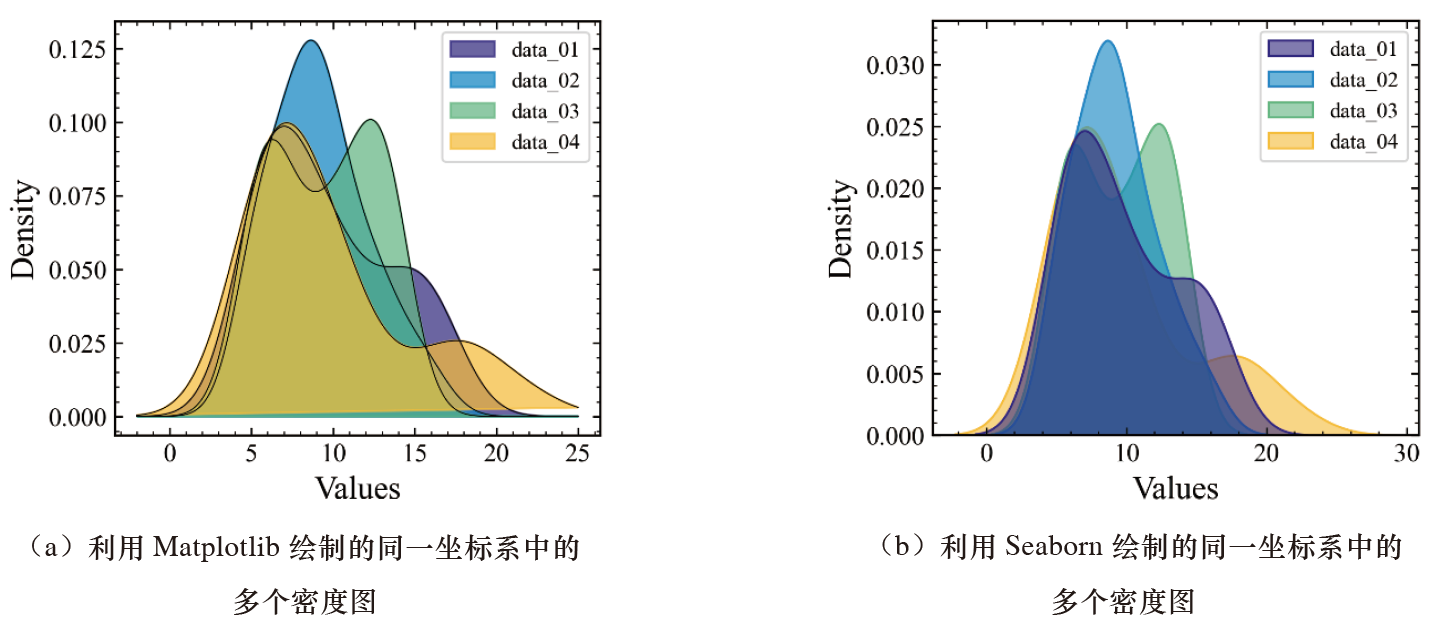
# Draw using Matplotlib
from scipy import stats
palette = ["#352A87", "#108ED2", "#65BE86", "#FFC337"]
fig,ax = plt.subplots(figsize=(4, 3.5), dpi=100)
for i, index, color in
	zip(range(len(palette)), data_df.columns, palette):
		data = data_df[index].values
		density = stats.kde.gaussian_kde(data)
		x = np.linspace(-2, 25, 500)
		y = density(x)
		ax.plot(x, y, lw=.5, color="k", zorder=5-i)
		ax.fill(x, y, color=color, label=index, alpha=.7)
ax.set_xlabel("Values")
ax.set_ylabel("Density")
ax.legend()

# Draw using Seaborn
fig,ax = plt.subplots(figsize=(4, 3.5), dpi=100)
sns.kdeplot(data=data_df, shade=True, palette= palette, alpha=.6, ax=ax)
ax.set_xlabel("Values")
Note that the default order of multiple density plots in the same coordinate system drawn using Seaborn differs from the Matplotlib plotting result.
When drawing Seaborn plotting objects in the editing environment of the ProPlot library, although both are advanced wrapper libraries developed based on Matplotlib, considerable differences still exist between them, making it impossible to form a unified syntax standard well in specific graph plotting. This results in weaker plotting customization operations when the ProPlot library draws Seaborn graph objects.
The figure below shows “multiple density plots in the same coordinate system” drawn using the ProPlot and SciencePlots libraries, respectively.
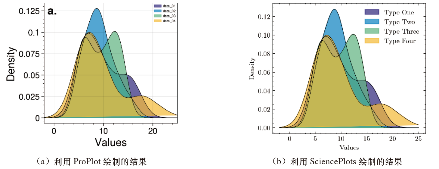
import pandas as pd
import numpy as np
from scipy import stats
import matplotlib.pyplot as plt

data_01 = [5.1,5.2,5.3,5.4,5.5,6.0,6.2,6.3,6.4,6.5,
           7.0,7.5,8.0,8.5,8.8,8.9,9.0,9.5,10,11,
           11.5,12,13,14,14.5,15,15.5,16,16.5,17]

data_02 = [5.1,5.2,5.3,5.4,5.5,6.0,7.0,7.3,7.4,7.5,
           8.0,8.2,8.4,8.6,8.8,9.0,9.2,9.4,9.6,9.8,
           10,10.2,11,11.5,12,12.5,13,13.5,15,16]
data_03 = [5.1,5.2,5.3,5.4,5.6,6.0,6.1,6.2,6.4,6.8,
           7.1,8.2,8.8,9.0,9.2,10.2,10.4,10.8,11,11.6,
           12,12.4,12.6,12.8,13,13.2,13.4,13.6,13.7,13.8]

data_04 = [5.0,5.2,5.3,5.4,5.6,5.8,6.0,6.2,6.4,6.6,
             6.8,7.0,7.2,7.4,7.6,8.0,9.0,9.2,9.6,9.8,
             10,10.3,11,12,16,16,18,18.5,19,22]
data_df = pd.DataFrame({"data_01":data_01,"data_02":data_02,
                        "data_03":data_03,"data_04":data_04})


#a) Result drawn using ProPlot

from scipy import stats
from proplot import rc
rc["axes.labelsize"] = 15
rc['tick.labelsize'] = 12
rc["suptitle.size"] = 15
palette = ["#352A87","#108ED2","#65BE86","#FFC337"]

fig = pplt.figure(figsize=(3.5,3))
ax = fig.subplot()
ax.format(abc='a.', abcloc='ul',abcsize=16,
          xlabel='Values', ylabel='Density')

for i, index,color in zip(range(len(palette)),data_df.columns,palette):
    data = data_df[index].values
    density = stats.kde.gaussian_kde(data)
    x = np.linspace(-2,25,500)
    y = density(x)
    ax.plot(x,y, lw=.5,color="k",zorder=5-i)
    ax.fill(x,y,color=color,label=index,alpha=.7)
ax.legend(ncols=1,frame=False,loc='ur')

plt.show()


#b) Result drawn using a ProPlot seaborn object

from proplot import rc
rc["axes.labelsize"] = 15
rc['tick.labelsize'] = 10
rc["suptitle.size"] = 16
rc["legend.fontsize"] = 5

palette = ["#352A87","#108ED2","#65BE86","#FFC337"]

fig = pplt.figure(figsize=(3.5,3))
ax = fig.subplot()
ax.format(abc='a.', abcloc='ul',abcsize=16,
          xlabel='Values', ylabel='Density')

sns.kdeplot(data=data_df,shade=True,palette = palette,alpha=.6,ax=ax)
plt.show()

#c) Result drawn using SciencePlots; with global variable settings, the font displays normally

import matplotlib.pyplot as plt
plt.style.use('science')

from scipy import stats
palette = ["#352A87","#108ED2","#65BE86","#FFC337"]
titles = ["Type One","Type Two","Type Three","Type Four"]
fig,ax = plt.subplots(figsize=(4,3.5),dpi=100,facecolor="w")
for i, index,color,label in zip(range(len(palette)),data_df.columns,palette,titles):
    data = data_df[index].values
    density = stats.kde.gaussian_kde(data)
    x = np.linspace(-2,25,500)
    y = density(x)
    ax.plot(x,y, lw=.5,color="k",zorder=5-i)
    ax.fill(x,y,color=color,label=label,alpha=.7)
ax.set_xlabel("Values")
ax.set_ylabel("Density")
ax.legend()

plt.show()
Related readings
- Types of Univariate Plots for Continuous Variables
- SciencePlots Basics and Features
- ProPlot Basics and Features
- Seaborn Basics and Features
- Foundations of Scientific Figure Design and Color
If you want to follow my updates, or have a coffee chat with me, feel free to connect with me: