ggplot2 and Other Plots
August 19, 2023 · 13 min read
If you have any questions, feel free to comment below. Click the block can copy the code.
And if you think it's helpful to you, just click on the ads which can support this site. Thanks!
1. Getting to Know the ggplot2 Package #
The ggplot2 package provides a plotting system based on a grammar of layers. It remedies the lack of consistency among functions in R’s base graphics system and raises R’s plotting capabilities to an entirely new level. The basic principles of the various data visualizations in ggplot2 are completely consistent: it maps mathematical space to the space of graphical elements. Imagine a blank canvas. On the canvas, we need to define the data to be visualized (data) and the mapping from data variables to graphical properties (mapping).
The mtcars dataset is used for plotting below.
This dataset is taken from the 1974 American magazine Motor Trend and contains 11 indicators concerning fuel consumption, design, performance, and other aspects of 32 automobiles: mpg (fuel consumption), cyl (number of cylinders), disp (displacement), hp (gross horsepower), drat (rear axle ratio), wt (vehicle weight), qsec (quarter-mile time), vs (engine type), am (transmission type), gear (number of forward gears), and carb (number of carburetors). We first explore the relationship between vehicle weight and fuel consumption by mapping the variable wt to the x-axis and the variable mpg to the y-axis.
library(ggplot2)
p <- ggplot(data = mtcars, mapping = aes(x = wt, y = mpg))
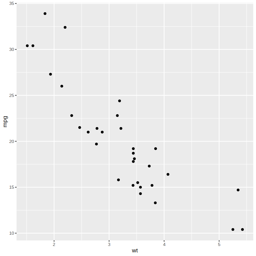
In the command above, aes represents aesthetic (aesthetics) elements, and we place all variables that need to be mapped in this function. Running p directly produces only a blank canvas; we still need to define what kind of graphics will represent the data. A series of functions beginning with geom is used to specify graphical elements, including points, lines, surfaces, polygons, and so on. Points (point) are used below as the geometric objects for displaying the data, with the result shown in the following figure.
p + geom_point()
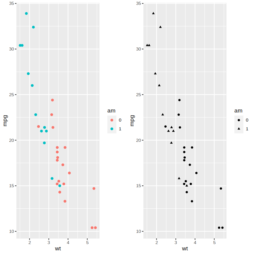
In addition to coordinate axes, variables can also be mapped to properties such as color (color), size (size), and shape (shape).
For example, to display the relationship between vehicle weight and fuel consumption under different transmission types, we can map the variable am to color (left in the figure below) or shape (right in the figure below). The variable am is a numerical variable in the original dataset (with values 0 and 1), but it should essentially be a categorical variable, so we first convert it into a factor with two levels.
library(gridExtra)
mtcars$am <- factor(mtcars$am)
p1 <- ggplot(data = mtcars, aes(x = wt, y = mpg, color = am)) + geom_point()
p2 <- ggplot(data = mtcars, aes(x = wt, y = mpg, shape = am)) + geom_point()
grid.arrange(p1, p2, nrow=1)
The plots above all display raw data. Sometimes we need to plot after summarizing the raw data in some way. For example, fit curves to the points in the figure above.
ggplot(data = mtcars, aes(x = wt, y = mpg, color = am)) + geom_smooth()
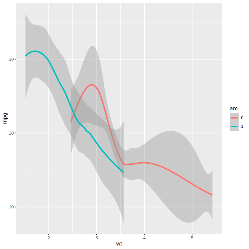
The default value of the method argument in the geom_smooth( ) function is “loess”, namely LOESS locally weighted regression
If you want to use another curve-fitting method, you can change the value of the method argument. For example, use linear regression
ggplot(data = mtcars, aes(x = wt, y = mpg, color = am)) +
        geom_smooth(method = "lm")
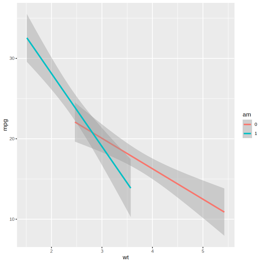
Both plots above have two fitted lines because we mapped the variable am to the color property. If only one smooth line is to be displayed, the color mapping needs to be set separately in the geom_point( ) function, with the result shown below.
ggplot(data = mtcars, aes(x = wt, y = mpg)) +
        geom_point(aes(color = am)) +
        geom_smooth()
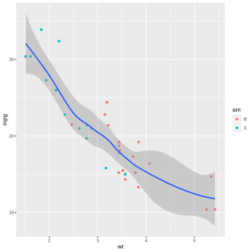
We now have the concept of a “layer”. A layer is like a sheet of cellophane containing various graphical elements. We can create multiple layers separately and then stack them together to form the final display.
The aes( ) function is like the brain of ggplot2, responsible for aesthetic design, while the many functions beginning with geom are like the hands of ggplot2, responsible for presenting these aesthetic designs. The ggplot2 package has more than 30 functions beginning with geom, and readers can view these functions through the package’s help documentation. Mapping is responsible only for associating a variable with a graphical property, not for specific values. For example, in the figure above, we map the variable am to color, but ggplot2 automatically selects which specific colors to use. To set the colors yourself, you need to use scale functions.
Scale functions are adjustment functions for graphical details, like a television remote control that can adjust properties such as the television’s volume, picture, and color. ggplot2 has a wide variety of scale functions beginning with scale that can be used to control the colors of a plot, the size and shape of points, and so on. For example, we can use the following scale function to manually set the desired colors, with the result shown below.
ggplot(data = mtcars, aes(x = wt, y = mpg)) +
        geom_point(aes(color = am)) +
        scale_color_manual(values = c("blue", "red")) +
        geom_smooth()
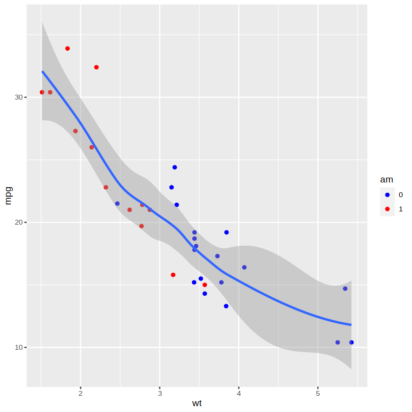
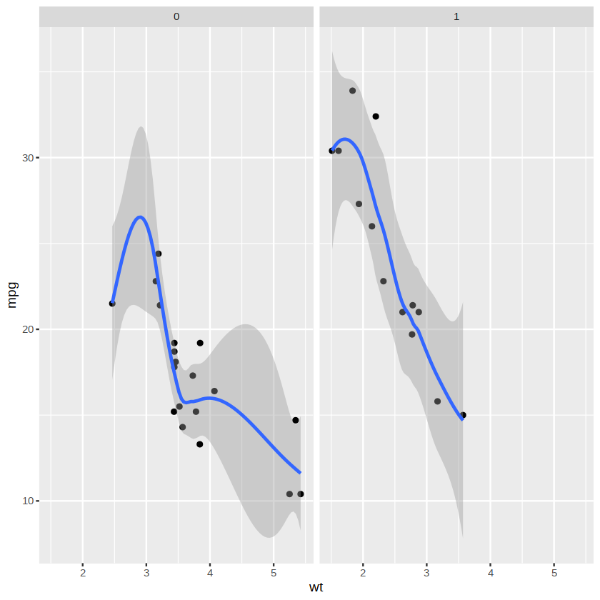
The ggplot2 package can also provide the grouped plotting functionality in the lattice package, namely faceting (facet). Faceting divides all the data into multiple subsets according to one or several categorical variables and then plots these subsets separately. For example, to display the figure above separately according to the two levels of the variable am, use the following command. The plotting result is shown below.
ggplot(data = mtcars, aes(x = wt, y = mpg)) +
        geom_point() +
        stat_smooth() +
        facet_grid(~ am)
Theme (theme) functions in the ggplot2 package are used to define the style of a plot, such as the canvas background. The following figure is an example of a canvas background with a black-and-white theme:
ggplot(data = mtcars, aes(x = wt, y = mpg)) +
        geom_point(aes(color = am)) +
        stat_smooth() +
        theme_bw()
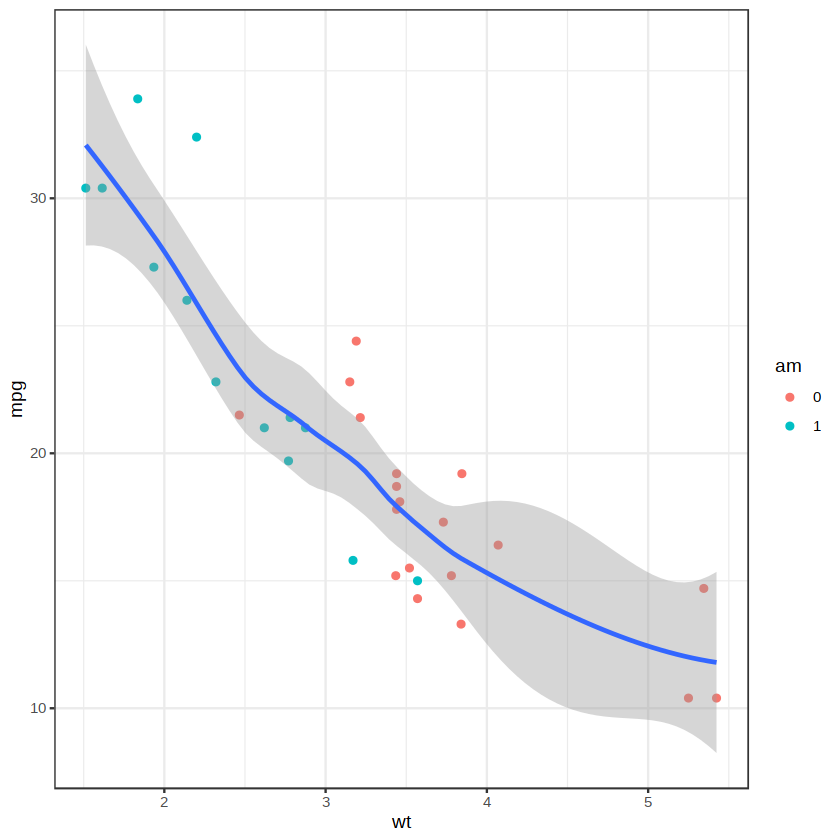
In addition to the themes included with the ggplot2 package, some extension packages provide a variety of theme styles, such as the ggthemes and artyfarty packages. These packages need to be installed before use, and interested readers can explore them on their own. The concepts of mapping (mapping), graphical elements (geom), scales (scale), facets (facet), and themes (theme) in the ggplot2 package were introduced above, and their basic usage was demonstrated. Next, we will explore methods for drawing commonly used statistical plots with the ggplot2 package.
2.Characteristics of Distributions #
In the process of exploring data, the most basic method is to observe the values of individual variables. For continuous variables, histograms or density curve plots can be drawn.
The anorexia dataset in the MASS package mentioned earlier is used for plotting below. First load the data and create the new variable wt.change (change in weight, unit: lb).
data(anorexia, package = "MASS")
anorexia$wt.change <- anorexia$Postwt - anorexia$Prewt
Next, use the ggplot2 package to draw a histogram of the variable wt.change. The code is as follows:
library(ggplot2)
p1 <- ggplot(anorexia, aes(x = wt.change)) +
        geom_histogram(binwidth = 2, fill = "skyblue", color = "black") +
        labs(x = "Weight change (lbs)") +
        theme_bw()
p1
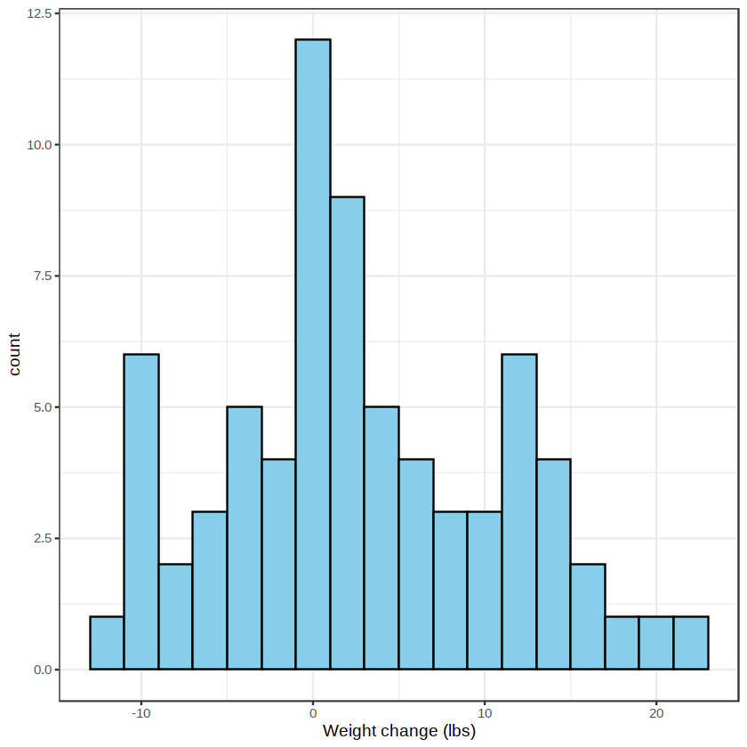
Here, the binwidth argument is used to set the bin width. Its default value is the range divided by 30, and different argument values can be tried when plotting to obtain a relatively satisfactory result. The fill argument is used to set the fill color. The color argument is used to set the color of the rectangular borders. We can also display the histogram and density curve at the same time, as shown below.
p2 <- ggplot(anorexia, aes(x = wt.change, y = ..density..)) +
        geom_histogram(binwidth = 2, fill = "skyblue", color = "black") +
        stat_density(geom = "line",linetype = "dashed", size = 1) +
        labs(x = "Weight change (lbs)") +
        theme_bw()
p2
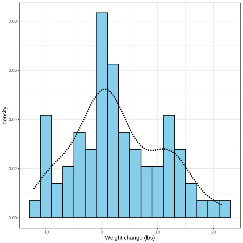
Here, “y = ..density..” is used to set the y-axis to frequency (density), and stat_density( ) is a statistical transformation used to calculate a density-estimation curve.
Density curves can also be used to compare the distributions of different data. For example, to compare the distributions of changes in weight under different treatment methods, enter the following code:
p3 <- ggplot(anorexia, aes(x = wt.change, color = Treat, linetype = Treat)) +
        stat_density(geom = "line", size = 1) +
        labs(x = "Weight change (lbs)") +
        theme_bw()
p3
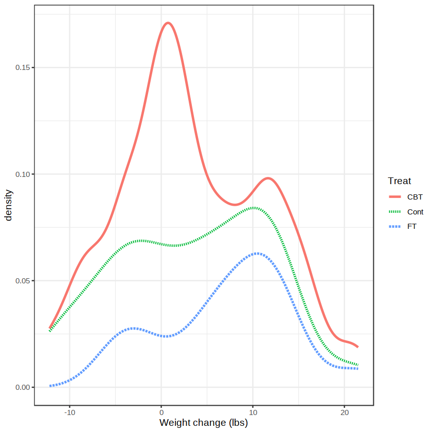
The command above first maps the variable Treat to color and line type, and then draws density curves for the change in weight, wt.change, under the three treatment methods, as shown above.
In addition to histograms and density curve plots, box plots are also often used to display the distribution of numerical variables, especially to compare distributions between groups. For example:
p4 <- ggplot(anorexia, aes(x= Treat, y = wt.change)) +
        geom_boxplot() +
        theme_bw()
p4
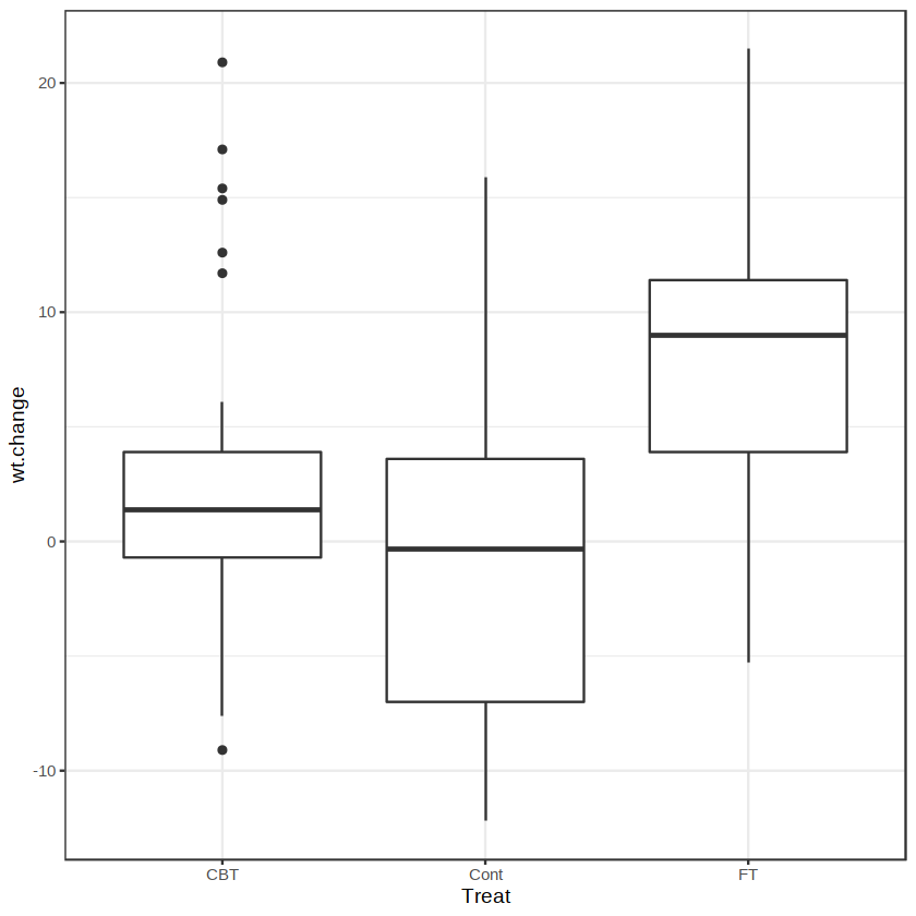
As can be seen from the figure above, the change in weight in the FT group is greater than in the other two groups, but the significance of the difference requires statistical testing before a conclusion can be reached.
The ggpubr package provides functionality for adding the statistical differences from between-group comparisons to parallel box plots. This package is a derivative package of ggplot2 and can generate statistical graphics for publication in papers, making it worthy of exploration by medical researchers. Statistical differences from comparisons of group means are added to the figure above below.
library(ggpubr)
my_comparisons <- list(c("CBT", "Cont"), c("CBT", "FT"), c("Cont", "FT"))
p5 <- ggplot(anorexia, aes(x= Treat, y = wt.change)) +
        geom_boxplot() +
        stat_compare_means(comparisons = my_comparisons,
                           method = "t.test",
                           color = "blue") +
        theme_bw()
p5
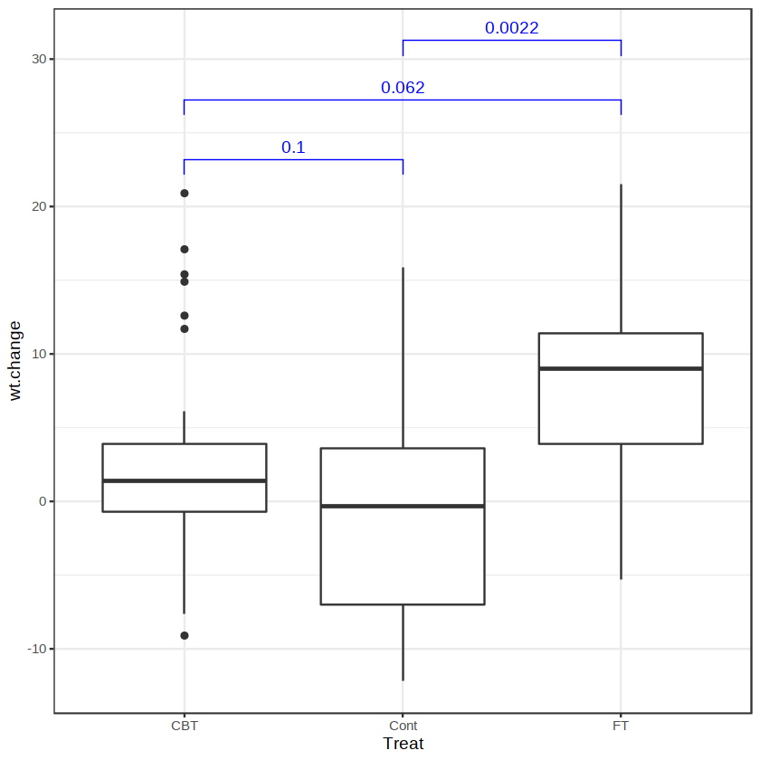
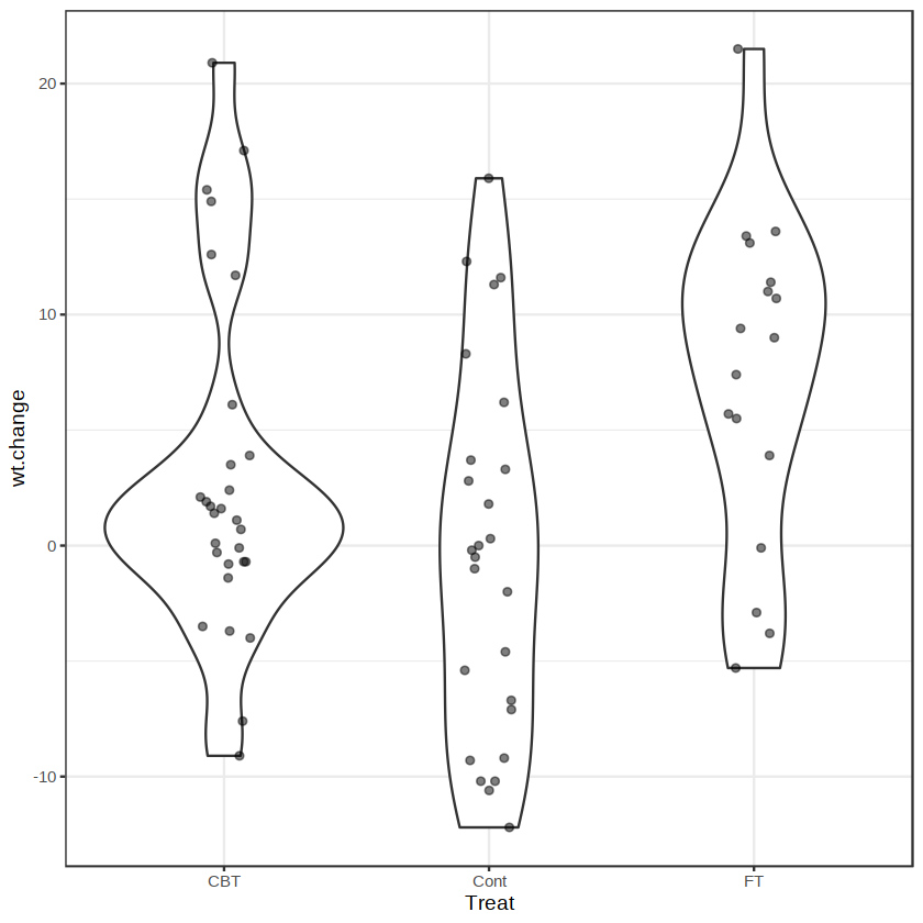
The p-values in the figure above were obtained through pairwise comparisons between groups using t-tests. In addition, we can also use ggplot2 to draw a violin plot similar to the figure above, with the result shown below.
p6 <- ggplot(anorexia, aes(x= Treat, y = wt.change)) +
        geom_violin() +
        geom_point(position = position_jitter(0.1), alpha = 0.5) +
        theme_bw()
p6
3.Composition of Proportions #
Many data involve questions of proportion. Extracting proportion information allows us to understand the importance of each component to the whole. The composition of proportions is commonly displayed with bar charts, for example:
library(vcd)
data(Arthritis)
ggplot(Arthritis, aes(x = Treatment, fill = Improved)) +
        geom_bar(color = "black") +
        scale_fill_brewer() +
        theme_bw()
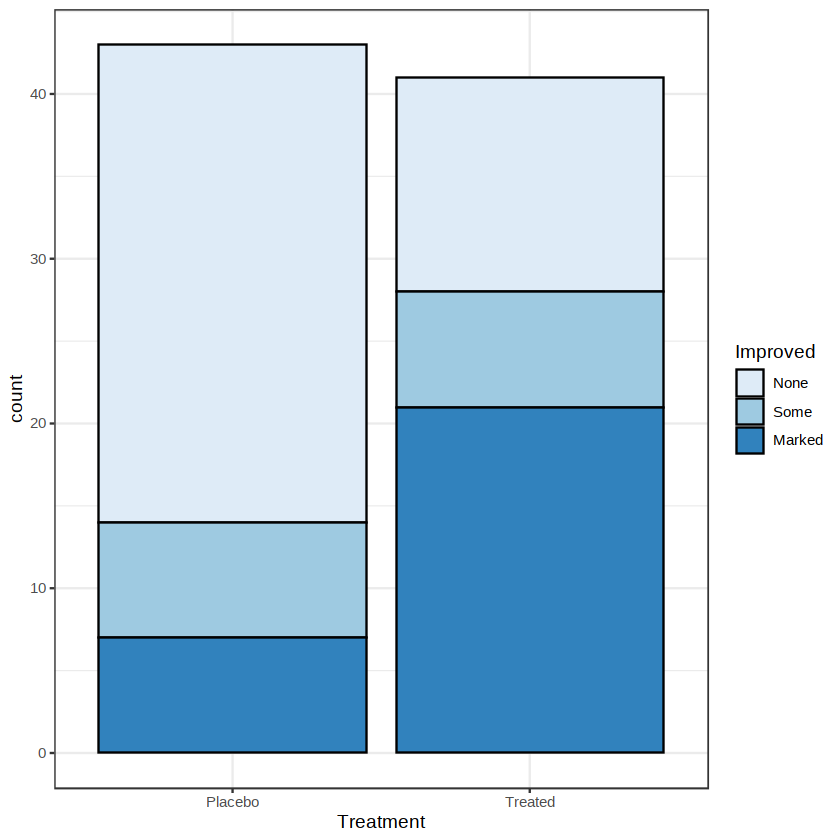
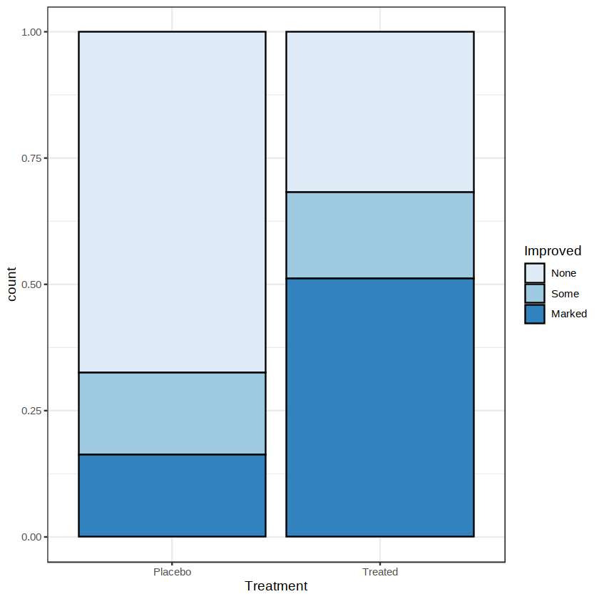
The figure above is called a stacked bar chart and is intended to display multiple variables simultaneously in one figure. The vertical coordinate in the figure is the absolute count. Sometimes, however, we prefer to observe relative proportions. This can be achieved by setting the position argument to “fill”, with the result shown below.
ggplot(Arthritis, aes(x = Treatment, fill = Improved)) +
        geom_bar(color = "black", position = "fill") +
        scale_fill_brewer() +
        theme_bw()
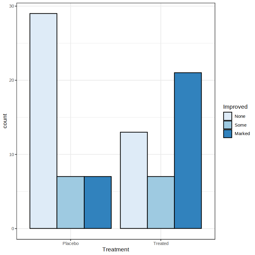
We can also set the position argument to “dodge” to place the bars side by side, as shown below.
ggplot(Arthritis, aes(x = Treatment, fill = Improved)) +
        geom_bar(color = "black", position = "dodge") +
        scale_fill_brewer() +
        theme_bw()
4.Saving Graphics with the ggsave( ) Function #
The ggsave( ) function is specifically used to save graphics drawn with the ggplot2 package. This function can export images in many different formats. For example:
p <- ggplot(mtcars, aes(wt, mpg)) + geom_point()
ggsave("myplot.png", p)
ggsave("myplot.pdf", p)
The commands above first create a scatter plot and save the result as p, and then use the ggsave( ) function to save the plot as files in png and pdf formats, respectively. Open the current working directory to see these two files.
If an image is to be used in a publication, we can set the image’s dimensions, resolution, and so on. For example, save the plot object p above in tiff format and set the image’s length and width to 12cm and 15cm, respectively, with a resolution of 500 dpi. The code is as follows:
ggsave("myplot.tiff", width = 15, height = 12, units = "cm", dpi = 500)
2. Other Plots #
2.1 Pyramid Plots #
A pyramid plot is a back-to-back bar chart often used to display the demographic structure of a study population, so it is also called a population pyramid. Both the PlotPyramid( ) function in the DescTools package and the pyramid( ) function in the epiDisplay package can be used to draw pyramid plots. A pyramid plot is drawn below using the Oswego dataset in the epiDisplay package as an example. The two variables age and sex in the dataset are needed here.
options(warn = -1)
library(epiDisplay)
data(Oswego)
pyramid(Oswego$age, Oswego$sex, col.gender = c(2, 4), bar.label = TRUE)
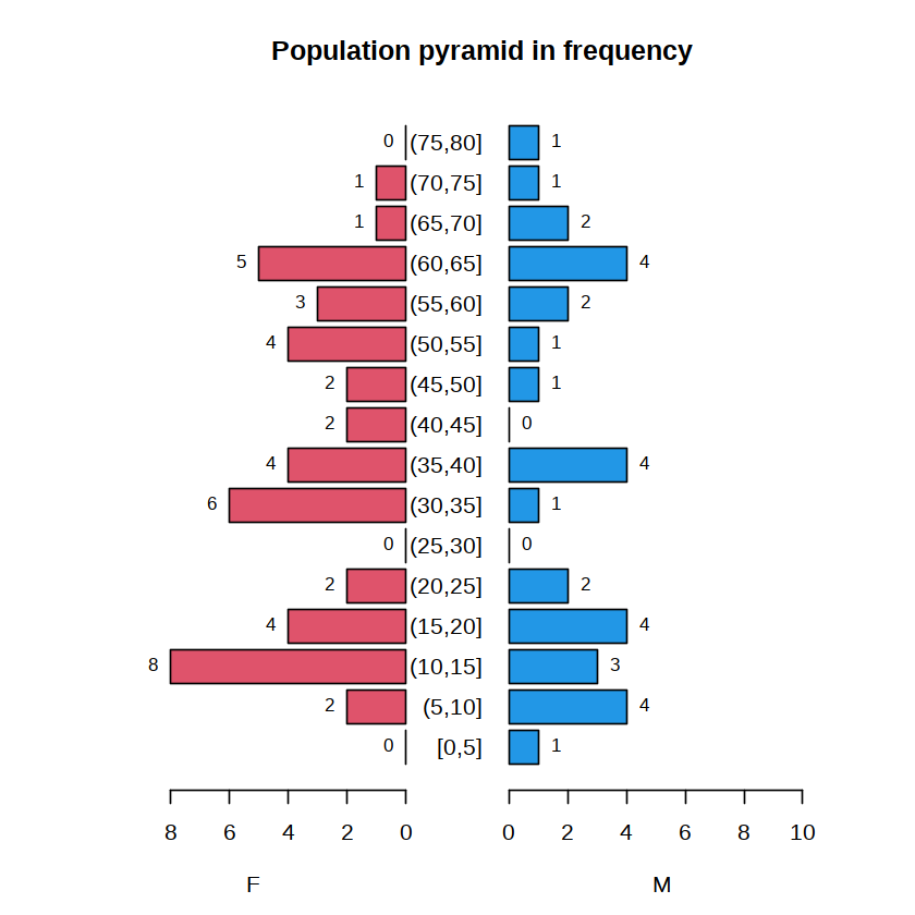
The figure above displays the frequency distribution of each age group for different sexes. The pyramid( ) function has many arguments that can be used to control the display details of the plot. Readers should view the function’s help documentation and try changing different argument settings to obtain satisfactory output.
2.2 Horizontal Stacked Bar Charts #
When conducting epidemiological surveys, it is often necessary to include many multiple-choice questions in a questionnaire. For a group of questions, the plot_stackfrq( ) function in the sjPlot package can be used to visualize the proportions of different options. The efc dataset in that package is used as an example for plotting below. Nine of its variables are needed here, corresponding to the nine multiple-choice questions in the questionnaire. Please install the sjPlot package before running the code below.
library(sjPlot)
data(efc)
names(efc)

head(efc)

qdata <- dplyr::select(efc, c82cop1:c90cop9)
plot_stackfrq(qdata)
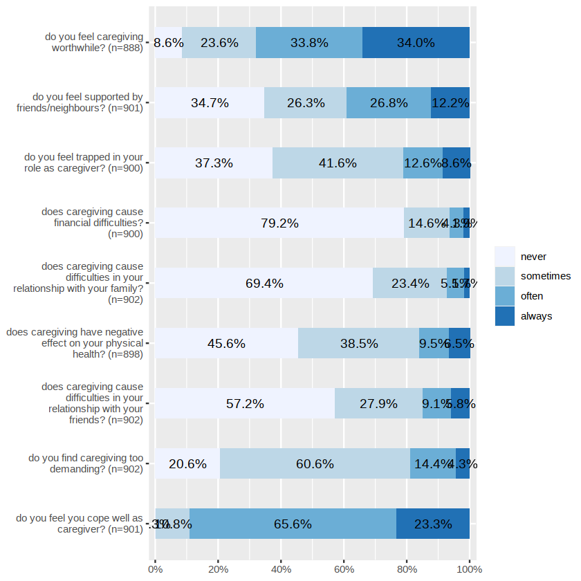
The plotting result is shown above. From the figure, we can obtain information such as the wording of each question, the number of respondents, and the percentage selecting each option.
The sjPlot package brings together many functions for visualizing data in epidemiology and the social sciences. Using these functions makes it easy to draw statistical graphics that are both attractive and practical, and they are worthy of further exploration by readers.
3.3 Heatmaps #
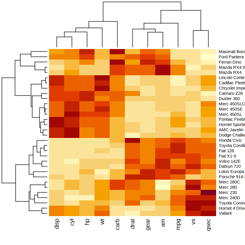
A heatmap is a color plot that represents the values of elements in a matrix with different colors and performs hierarchical clustering on the rows or columns of the matrix. Through a heatmap, we can not only directly observe the distribution of values in the matrix, but also learn the clustering results. For a further introduction to cluster analysis, see Chapter 10. Heatmaps are often used in bioinformatics data analysis. Taking RNA-seq as an example, a heatmap can intuitively present changes in global expression levels across multiple samples or multiple genes, and can also present clustering relationships among the expression levels of multiple samples or multiple genes.
The heatmap( ) function in the stats package can be used to create heatmaps. The use of this function is introduced below using the mtcars dataset as an example. Because the measurement scales of the variables in this dataset differ considerably, we first need to use the scale( ) function to standardize the variables. The matrix composed of the standardized variables can be used as input to the heatmap( ) function, and the plotting result is shown below.
data(mtcars)
dat <- scale(mtcars)
class(dat)
heatmap(dat)
3.4 Three-Dimensional Scatter Plots #
The plots mentioned above are all two-dimensional. To visualize the relationship among three numerical variables, use the scatterplot3d( ) function from the scatterplot3d package. Please install the package before use.
The argument options provided by the scatterplot3d( ) function include settings for graphical symbols, highlighting, angles, colors, lines, coordinate axes, grid lines, and so on. The use of this function is illustrated below with the trees dataset in the datasets package as an example. This dataset contains three numerical variables: Girth, Height, and Volume. We draw a three-dimensional scatter plot using these three variables as coordinate axes, respectively, with the result shown below.
library(scatterplot3d)
data(trees)
scatterplot3d(trees, type = "h", highlight.3d = TRUE, angle = 55, pch = 16)
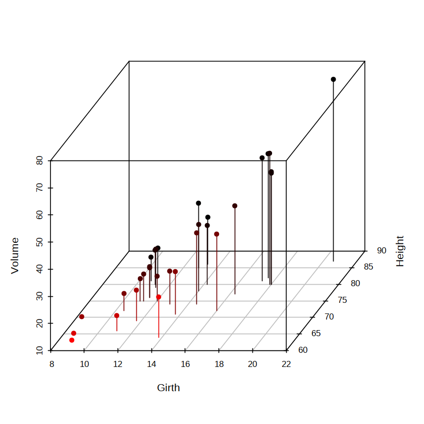
The type argument in the scatterplot3d( ) function above is used to set the plotting type. It defaults to “p” (points) and is set here to “h” to display vertical line segments. The angle argument is used to set the angle between the x-axis and y-axis. It should be noted that when a static three-dimensional scatter plot is used to describe the relationship among three variables, it may be affected by the viewing angle.
3.5 Summary #
Some other specialized plots, such as scatter plot matrices, correlation plots, normal QQ plots, survival curves, cluster plots, scree plots, ROC curves, and forest plots for Meta-analysis, will be introduced successively in later chapters together with statistical analysis methods. In applications of R, visualization is a very active field, and new packages continue to emerge. The website The R Graph Gallery[1] collects various novel plots and corresponding example code and is worthy of the attention of readers interested in visualization.
References
Related readings
- Plotting with R's Base Graphics System
- Handling Missing Values
- Merging Data Frames
- Using the dplyr Package
- Using Base R
If you want to follow my updates, or have a coffee chat with me, feel free to connect with me: