Plotting with R's Base Graphics System
August 19, 2023 · 12 min read
If you have any questions, feel free to comment below. Click the block can copy the code.
And if you think it's helpful to you, just click on the ads which can support this site. Thanks!
R’s base graphics system was written by Ross Ihaka and is very powerful. It consists mainly of the graphics and grDevices packages, which are loaded automatically when R starts. There are two types of functions in the base graphics system: high-level plotting functions and low-level plotting functions.
High-level plotting functions are functions used to produce plots directly, including plot( ), hist( ), boxplot( ), and pairs( ). Low-level plotting functions are functions used to add new graphics or elements to a plot drawn by a high-level plotting function, including points( ), lines( ), text( ), title( ), legend( ), and axis( ).
1. The plot( ) Function #
The plot( ) function is a generic function that can draw different plots for different types of data. For example, it can draw scatter plots for numerical data; box plots for categorical data; and corresponding plots for some statistical models, such as survival curves for survival analysis. Therefore, the plot( ) function is used very frequently, and it is recommended that you open its help documentation to view the usage of its various commonly used arguments.
The following creates example data representing the responses of patients with a certain disease to two drugs (drugA and drugB) at five dose (dose) levels.
dose <- c(20, 30, 40, 45, 60)
drugA <- c(16, 20, 27, 40, 60)
drugB <- c(15, 18, 25, 31, 40)
Use the data above to draw a plot of the relationship between the dose of drug A and the response:
plot(dose, drugA)
plot(dose, drugA, type = "b")
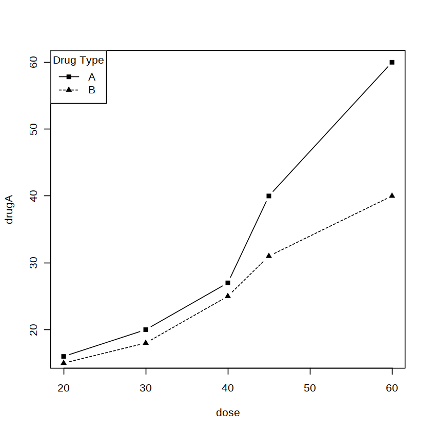
The commands above create two plots. The type argument in the plot( ) function defaults to “p” (representing points), so the first plot obtained is a scatter plot. In the second command, the type argument is changed to “b” (representing points and lines), so the second plot obtained is a point-and-line plot.
The plot( ) function is used to create a new plot. We can also use low-level plotting functions, such as lines( ) and legend( ), to add new graphical elements to an existing plot. For example:
# To compare the responses to the two drugs at different doses, we display two point-and-line plots in one plot and distinguish them using different line types (lty) and different point symbols (pch).
plot(dose, drugA, type = "b", lty = 1, pch = 15)
lines(dose, drugB, type = "b", lty = 2, pch = 17)
# A legend is also added to improve readability.
# Note that the point and line properties in the legend( ) function must match the properties set earlier in the plot( ) and lines( ) functions.
legend("topleft", title = "Drug Type",
       legend = c("A", "B"),
       lty = c(1, 2),
       pch = c(15, 17))
2.Histograms and Density Curve Plots #
A histogram is the most commonly used tool for displaying the distribution of a continuous variable; it is essentially an estimate of the density function. Histograms and density curve plots are generally used to explore distributions and are rarely used to report results. The hist( ) function can be used to draw histograms.
The anorexia dataset is in the MASS package and comes from a study of weight changes in young women with anorexia. The dataset contains 72 observations and 3 variables. The variable Treat (treatment method) is a factor with 3 levels, while the variables Prewt and Postwt are both numerical and represent weight before and after treatment, respectively (unit: lb). A histogram of the variable Prewt is drawn below with the following code:
library(MASS)
data(anorexia)
str(anorexia)

attach(anorexia)
hist(Prewt)
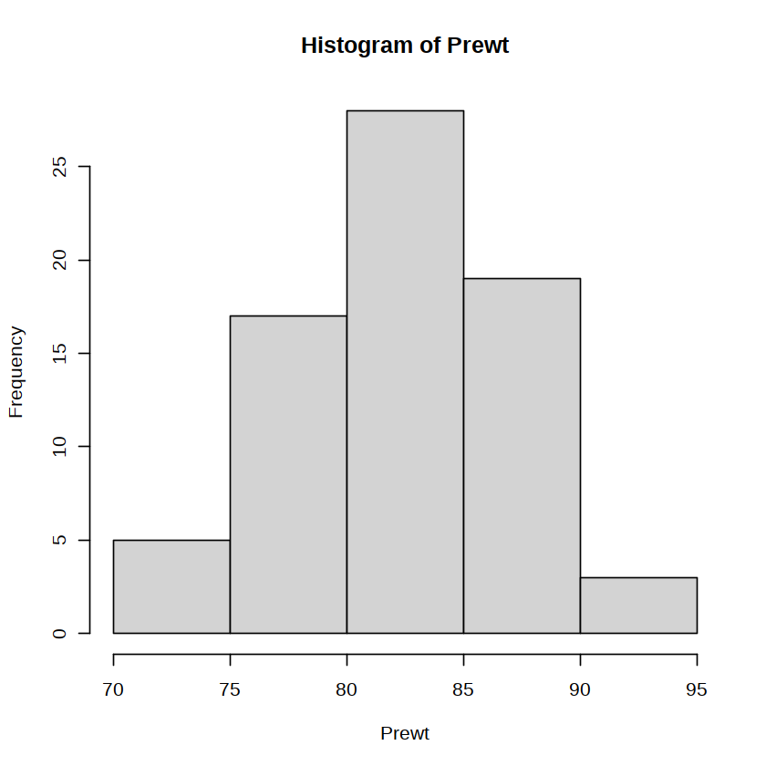
The figure above shows the frequency distribution of the variable Prewt. Because no arguments were set in the hist( ) function, the figure uses the default bin width, axis labels, title, and so on. It should be noted that the shape of a histogram is affected by the bin width, and sometimes we need to try setting different values for the breaks argument to obtain an appropriate figure. The output of the hist( ) function contains some calculated return values that can be used for further plotting or analysis, such as interval endpoints, frequencies (or densities), and interval midpoints.
A density curve provides a smoother description of the distribution of the data. The method for drawing a density curve is:
plot(density(Prewt))
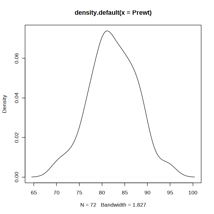
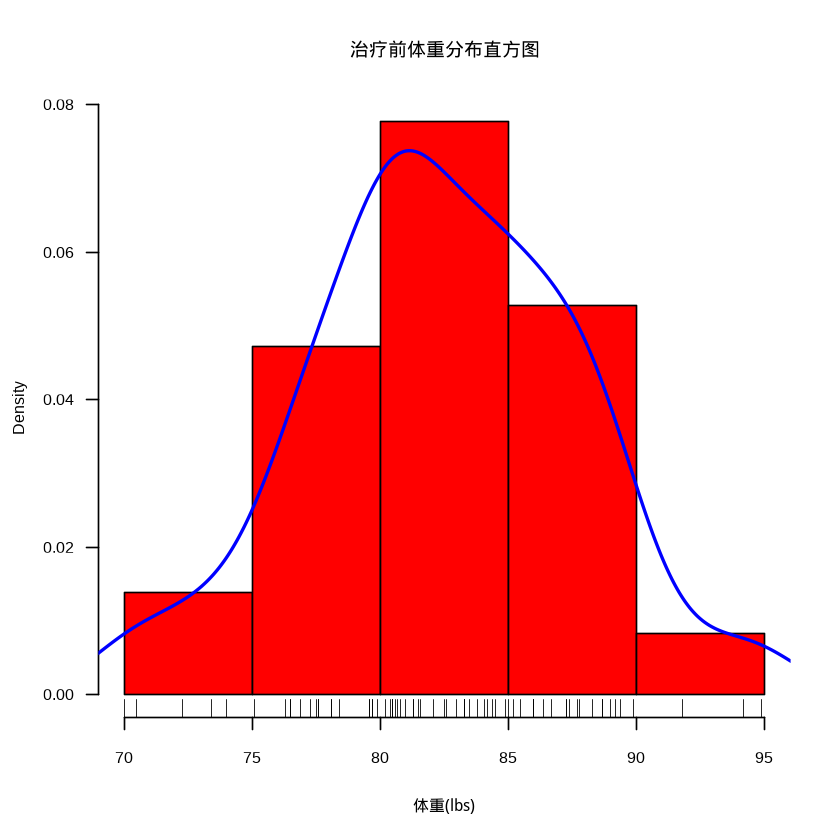
As can be seen from the figure above, the distribution of the variable Prewt is unimodal and basically symmetric. We can also add a density curve and a rug plot to a histogram. At this point, the freq argument in the hist( ) function needs to be set to FALSE, that is, the vertical axis must be changed to frequency; otherwise, the density curve will be almost invisible. Setting the las (or labels) argument to 1 displays the tick labels on the vertical axis horizontally.
library("showtext") # The R data analysis image does not support Chinese very well, so the showtext package is needed
showtext_auto() # Automatically support Chinese
# Fill the bars with red, add more informative axis labels and a title, and set the las argument to 1 to display the vertical-axis tick labels horizontally.
hist(Prewt, freq = FALSE, col = "red",
     xlab = "Weight (lbs)",
     main = "Histogram of Pre-Treatment Weight Distribution",
     las = 1)
# Then use the lines( ) function to superimpose a blue density curve twice the default line width on the histogram.
lines(density(Prewt), col = "blue", lwd = 2)
# Finally, use the rug( ) function to add a rug plot to the horizontal axis to show the concentration trend of the data distribution.
rug(Prewt)
detach(anorexia)
3.Bar Charts #
Bar charts are often used in medical scientific papers. They display the frequency distribution of categorical variables through vertical or horizontal rectangles. The barplot( ) function can be used to draw bar charts.
The use of the barplot( ) function is introduced below using the Arthritis dataset in the vcd package as an example. This dataset comes from a grouped, controlled, double-blind clinical trial of a new method for treating rheumatoid arthritis. The response variable Improved records the treatment outcome for each patient who received drug treatment (Treated, 41 cases) or a placebo (Placebo, 43 cases), divided into 3 levels (None, Some, and Marked).
library(vcd)
data(Arthritis)
attach(Arthritis)
counts <- table(Improved)
counts
# Improved
#   None   Some Marked
#     42     14     28
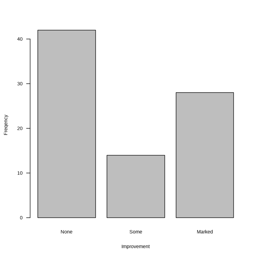
The table( ) function is used to generate a frequency table for a categorical variable. From the output above, it can be seen that 28 patients showed marked improvement, 14 showed some improvement, and 42 showed no improvement. A bar chart can be used to display this frequency distribution, as shown below:
barplot(counts, xlab = "Improvement", ylab = "Freqency", las = 1)
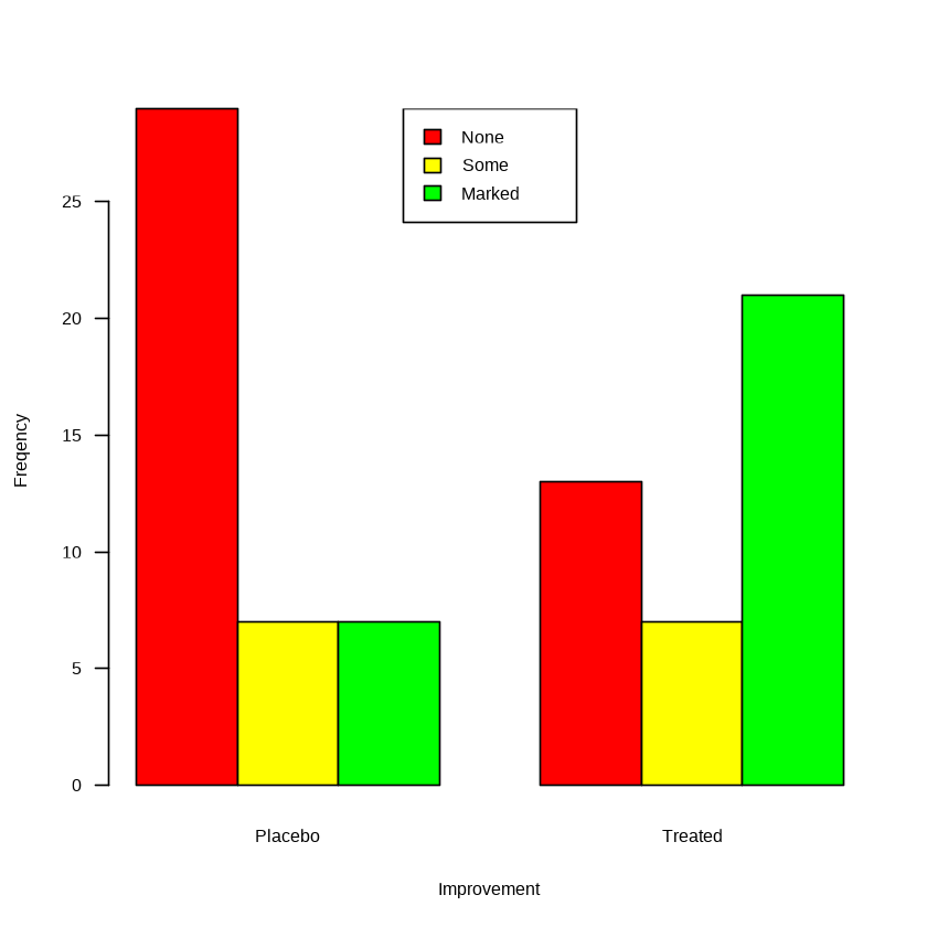
The barplot( ) function can also be used to display data from a two-dimensional contingency table. The following figure draws a grouped bar chart and adds colors and a legend. The code is as follows:
counts <- table(Improved, Treatment)
barplot(counts,
        col = c("red", "yellow", "green"),
        xlab = "Improvement",
        ylab = "Freqency",
        beside = TRUE, las = 1)
legend("top", legend = rownames(counts),
       fill = c("red", "yellow", "green"))
Bar charts can sometimes also be used to display means, medians, standard deviations, confidence intervals, and so on for different categories. Functions in the base package can provide this functionality, but many steps are required. The aggregate.plot( ) function in the epiDisplay package can simplify this process.
Using the anorexia dataset as an example, the following code draws a bar chart of the mean post-treatment weight under different treatment methods. The result is shown below.
library(epiDisplay)
aggregate.plot(anorexia$Postwt, by = list(anorexia$Treat),
               error = "sd", legend = FALSE,
               bar.col = c("red", "yellow", "green"),
               ylim = c(0,100), las = 1,
               main = "")
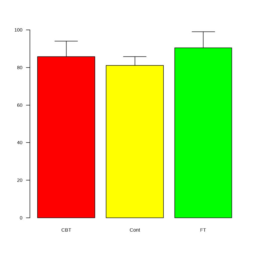
The error bars above represent standard deviations. We can display standard errors or confidence intervals by changing the error argument in the aggregate.plot( ) function.
4. Pie Charts #
A pie chart can be used to display the proportions of categorical data. For example, the pie chart drawn by the following code shows the distribution of disease types among emergency admissions to a hospital during one week.
percent <- c(5.8, 27.0, 0.5, 20.8, 12.8, 33.1)
disease <- c("Upper respiratory infection", "Stroke", "Trauma", "Syncope", "Food poisoning", "Other")
lbs <- paste0(disease, percent, "%")
pie(percent, labels = lbs, col = rainbow(6))
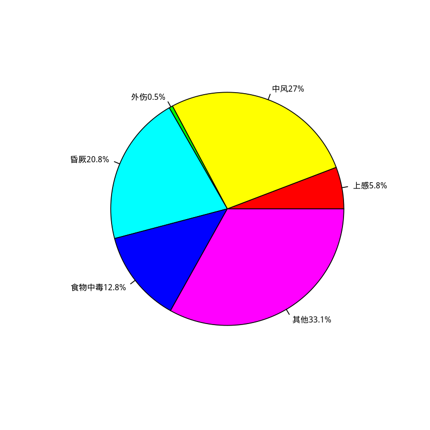 Most statisticians do not recommend using pie charts. They recommend using bar charts or dot plots instead because people judge length more accurately than area. Therefore, the
 pie( ) function in the base package has limited options for drawing pie charts.
However, some contributed packages extend R’s capabilities for drawing pie charts, such as the plotrix package. The pie3D( ) function provided by this package can draw three-dimensional pie charts, and another function, fan.plot( ), can draw fan plots with functionality similar to pie charts. Interested readers can install the package and view its help documentation.
5. Box Plots and Violin Plots #
A box plot, also known as a box-whisker plot, is often used to display the approximate distributional characteristics of data and to explore anomalous values and outliers. The boxplot( ) function can be used to draw box plots.
The distribution of changes in weight in the anorexia dataset is displayed below using a box plot.
anorexia$wt.change <- anorexia$Postwt - anorexia$Prewt
boxplot(anorexia$wt.change, ylab = "Weight change (lbs)", las = 1)
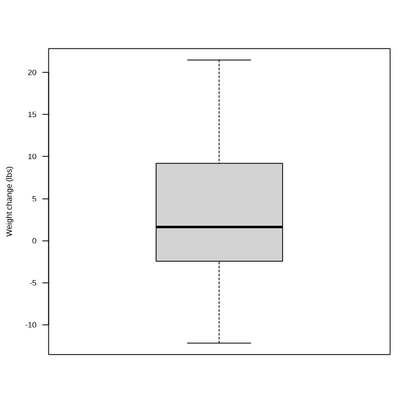
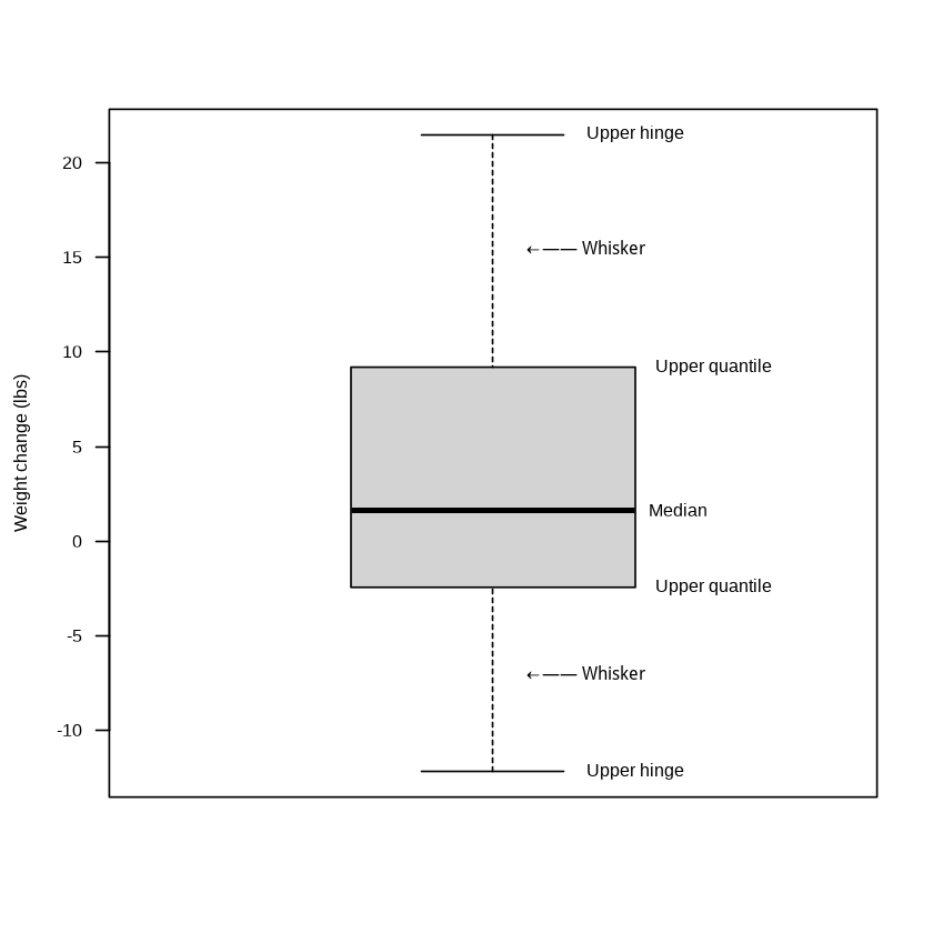
To help readers better understand the meaning of each part of a box plot, manual annotations have been added to the figure below. If the data are symmetrically distributed, the median (Median) should lie midway between the upper quartile (Upper quartile) and the lower quartile (Lower quartile), meaning that the box in the box plot is symmetric about the median line. Values beyond the upper hinge (Upper hinge) and lower hinge (Lower hinge) are generally considered anomalous values.
fivenum(anorexia$wt.change)

anorexia$wt.change <- anorexia$Postwt - anorexia$Prewt
b <- boxplot(anorexia$wt.change, ylab = "Weight change (lbs)", las = 1)
# text(x= 1, y=1:5, labels= c("some","more","red text"))
text(1.2, 21.5, "Upper hinge")
text(1.13, 15.5, "←—— Whisker")
text(1.31, 9.2, "Upper quantile")
text(1.26, 1.65, "Median")
text(1.31, -2.45, "Upper quantile")
text(1.13, -7, "←—— Whisker")
text(1.2, -12.2, "Upper hinge")
 Box plots arranged in parallel can be used to compare the distribution of an indicator across the categories of a categorical variable. For example, to compare weight changes under different treatment methods, use the following command:
boxplot(wt.change ~ Treat, data = anorexia,
        ylab = "Weight change (lbs)", las = 1)
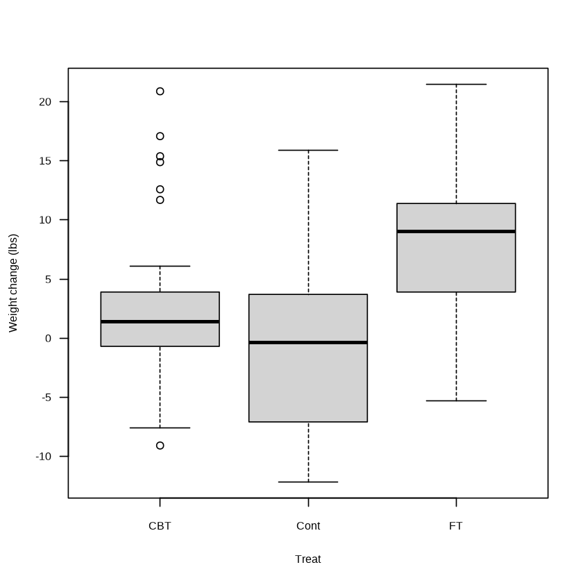
The first argument supplied to the boxplot( ) function is a formula. Formulas in R generally connect variables with the symbol ~; the left side of ~ can be regarded as the dependent variable, and the right side of ~ can be regarded as the independent variable. From figure (a) below, it can be seen that the change in weight in the “FT” (family treatment) group is greater than in the other two groups. However, the significance of the difference must be determined through further significance testing.
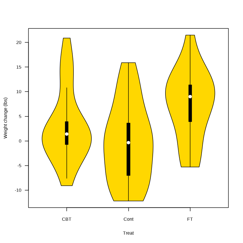
A violin plot can be regarded as a combination of a box plot and a density plot. The vioplot( ) function in the vioplot package can be used to draw violin plots. Please install and load the package before use. For example, the figure above can instead be displayed as a violin plot
options(warn=-1) # Clean display
library(vioplot)
vioplot(wt.change ~ Treat, data = anorexia,
        ylab = "Weight change (lbs)",
        col = "gold", las = 1)
6. Cleveland Dot Plots #
A Cleveland dot plot is essentially also a scatter plot. It displays the magnitude of data through the positions of points and is a method for plotting a large number of labeled values on a simple horizontal scale. Its function is similar to that of a bar chart, but it emphasizes the ordering of the data and the gaps between them.
The dotchart( ) function can be used to draw Cleveland dot plots. The VADeaths dataset in the datasets package contains the mortality rates (expressed in ‰) for people of different age groups in urban and rural Virginia in the United States in 1940.
VADeaths
dotchart(VADeaths)
dotchart(t(VADeaths),pch = 19)
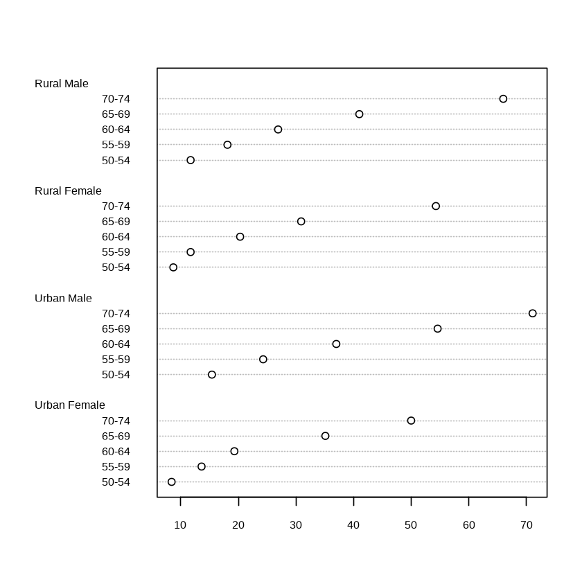
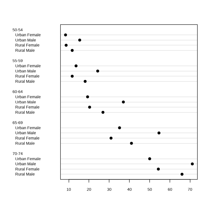
As can be seen from the figures above, mortality increases with age; within the same age group, mortality in rural areas is higher than in urban areas; and within the same age group and the same area, male mortality is higher than female mortality.
7. Exporting Graphics #
If you want to save a graphic, you can do so in two ways: through the graphical user interface or through code. Under “Plots” at the lower right of RStudio, click “Export” and select “Save as Image” or “Save as PDF” to save the graphic in a specified folder. We can also select “Copy to Clipboard” to copy the graphic directly into a Word or PowerPoint document. It should be noted that a graphic saved in this way is related to the size of the RStudio graphics window, meaning that windows of different sizes will produce different graphics (in ModelWhale, you can right-click the image and save it directly as another file).
If you want to save a graphic for use in a report or paper, the author recommends using code by placing the plotting statements between the statement that opens the target graphics device and the statement that closes the target graphics device. For example, the following code saves the graphic in the current working directory and names it “mygraph.pdf”:
pdf("mygraph.pdf")
boxplot(wt.change ~ Treat,
        data = anorexia,
        ylab = "Weight change (lbs)",
        las = 1)
dev.off() # The pdf can be seen under work
In addition to the pdf( ) function, we can also use functions such as png( ), jpeg( ), tiff( ), and postscript( ) to save graphics in other formats.
Graphic files in bmp, png, and jpeg formats are all non-vector formats and are easily affected by resolution, but they occupy very little space and are suitable for use in Word and PowerPoint documents; graphic files in ps format are vector-format files, are independent of resolution, and are suitable for typesetting and printing; graphic files in tiff (or tif) format support many color systems and are independent of the operating system, making them the most widely used in various publications. For example:
tiff(filename = "mygraph.tiff",
     width = 15, height = 12, units = "cm", res = 300)
boxplot(wt.change ~ Treat, data = anorexia, ylab = "Weight change (lbs)")
dev.off() # The tiff can be seen under work
The commands above generate a graphic file named “mygraph.tiff”. The width and height arguments are used to set the width and height of the graphic, respectively; the units argument is used to set the units of the width and height; and the res argument is used to set the resolution, which is set here to the minimum value of 300 required by most publications.
Summary #
Some other specialized plots include scatter plot matrices, correlation plots, normal QQ plots, survival curves, cluster plots, scree plots, ROC curves, and forest plots for Meta-analysis. In applications of R, visualization is a very active field, and new packages continue to emerge. The website The R Graph Gallery[1] collects various novel plots and corresponding example code and is worthy of the attention of readers interested in visualization.
References
Related readings
If you want to follow my updates, or have a coffee chat with me, feel free to connect with me: